

28 Aug Learning to Redesign: I Saw a Peacock with a Fiery Tail
By Disha Naik
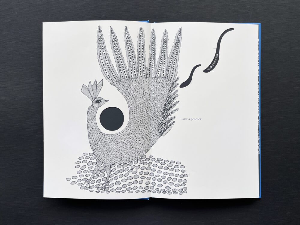
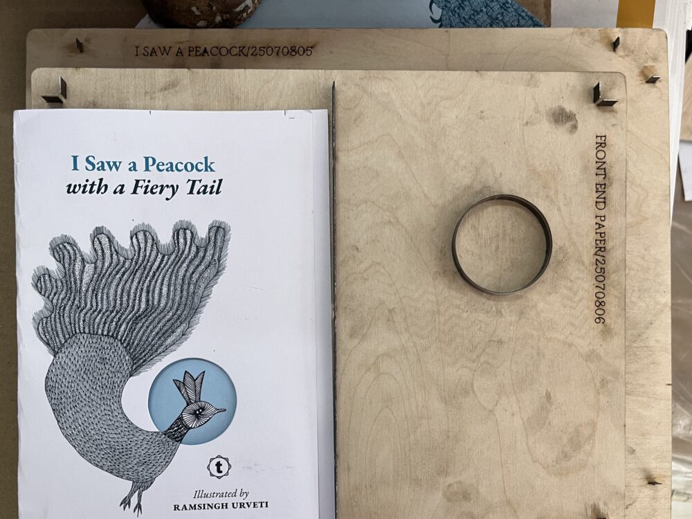
I have been with Tara Books as a designer for a year. Amongst the several projects I have worked on, this was a rather special one. I was given the task to relook an illustrated Tara classic – I Saw a Peacock with a Fiery Tail which was released in 2010 and has been reprinted several times after that. With stunning art by Pardhan Gond artist, Ramsingh Urveti and a clever design by Jonathan Yamakami – flipping through it has always been fascinating. The playful form of the book lends visual context to the text, which is a form of trick verse, composed in 17th century England.
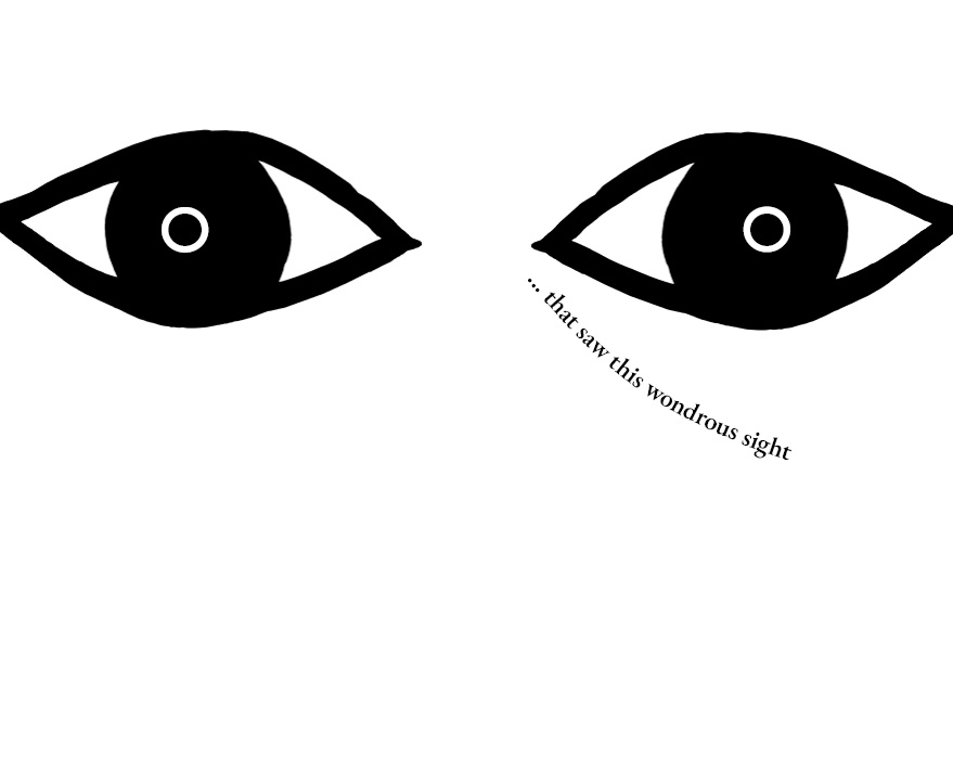
I Saw a Peacock with a Fiery Tail at first seems nonsensical, but if given a break in the middle of each line, another meaning begins to unravel.
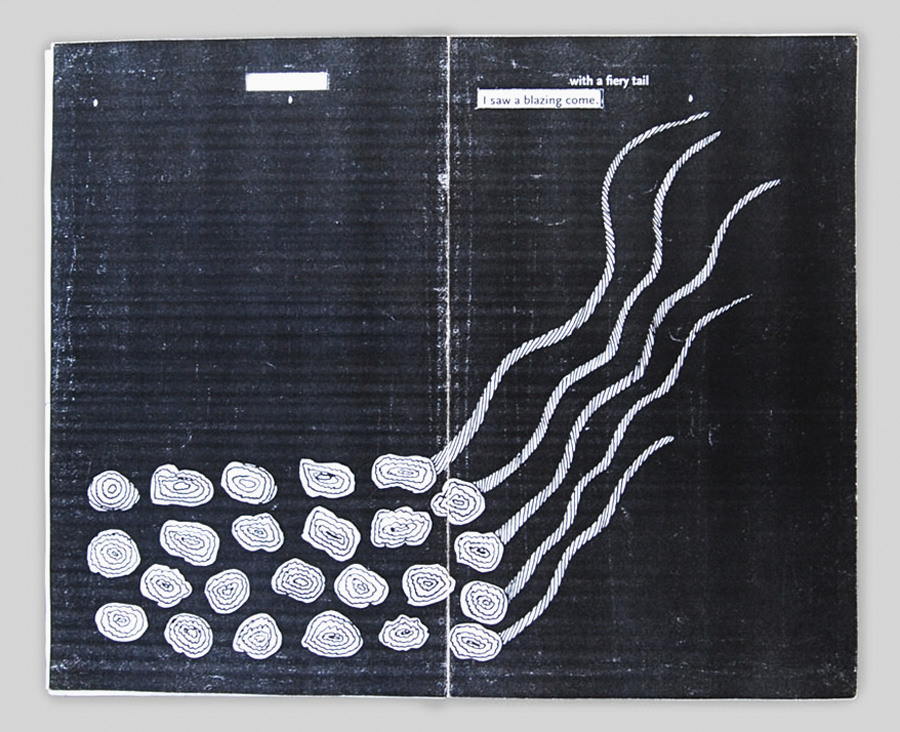
I saw a peacock | with a fiery tail
I saw a blazing comet | drop down hail
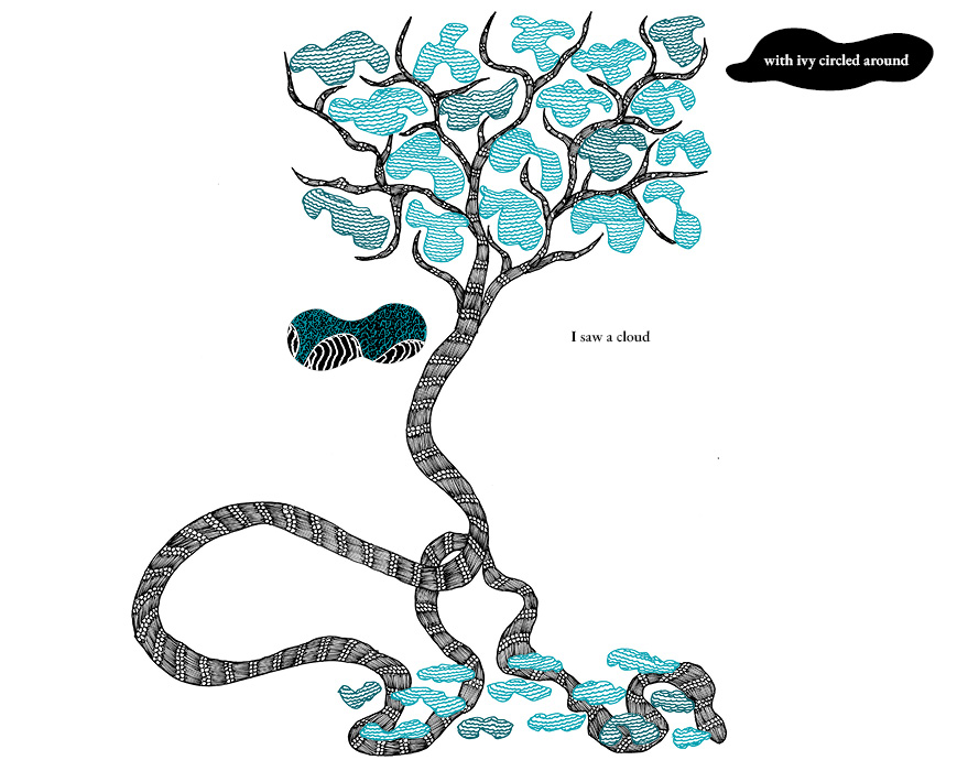
I saw a cloud…
Ramsingh’s illustrations, poetic and intense, captured the poem’s fantastical character but the challenge before the publishers was this: how to integrate text and image in ways that would communicate the poem’s twinned meanings. Jonathan Yamakami, the book’s original designer, worked with a range of ideas, before settling on the use of die-cuts and integrating them seamlessly with the illustrations and the verse. This first edition (2010) was a grand success. Returning to it 15 years later, Tara Books decided to relook its visual content. This is where I came into the project.
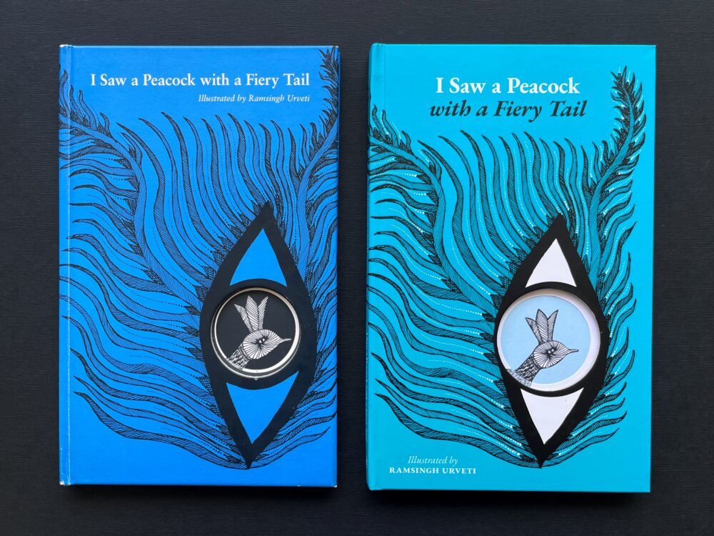
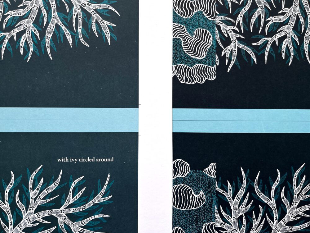
Left: 2010 edition; right: 2025 edition
Redesigning a successful book can be a challenge. It led me to questions such as: how to rethink something that already has been through a meticulous design process? How to retain the integrity of the original design but at the same time, enhance it with a fresh take?
The Original Design
Before I started work on the re-design, I decided to find out how the book was originally designed – from notes left behind by Jonathan Yamakami. The challenge before him was this: to come up with a design for the book that presents both readings without actually printing the poem twice.
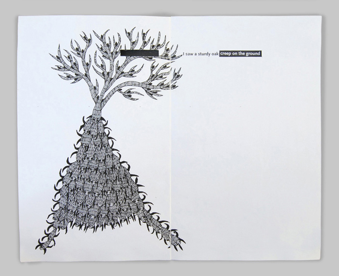
His initial idea was to use transparent paper and print with two colours. But this idea was somewhat unworkable – for one, it was financially untenable. Reviewing his design options, Jonathan looked up the work of Katsumi Komagata, a Japanese graphic designer whose books featured an array of subtly executed die-cuts. He decided that he would experiment with these latter. While that seemed a more viable design choice, it was not an easy one. Jonathan started with rectangular die-cuts, but while they concealed and revealed words, they were functional at best. They did not help to capture or suggest another layer of meaning.
Initial concept dummies made by Jonathan
Around this time, Rathna Ramanathan, who had set the design tone for Tara Books, suggested that Jonathan re-think the die-cuts, in terms of their position on the page and their relationship with the illustrations. She pointed out that the cuts were part of the narrative and ought to be viewed as telling a story. Even as Jonathan began reviewing his work, inspiration came from another source. Marion Bataille, well-known French designer and book architect who was visiting Tara Books, pushed him to do more. She asked him several leading questions: why were the die-cuts so austere? Why was the text fixed in such a strong grid?
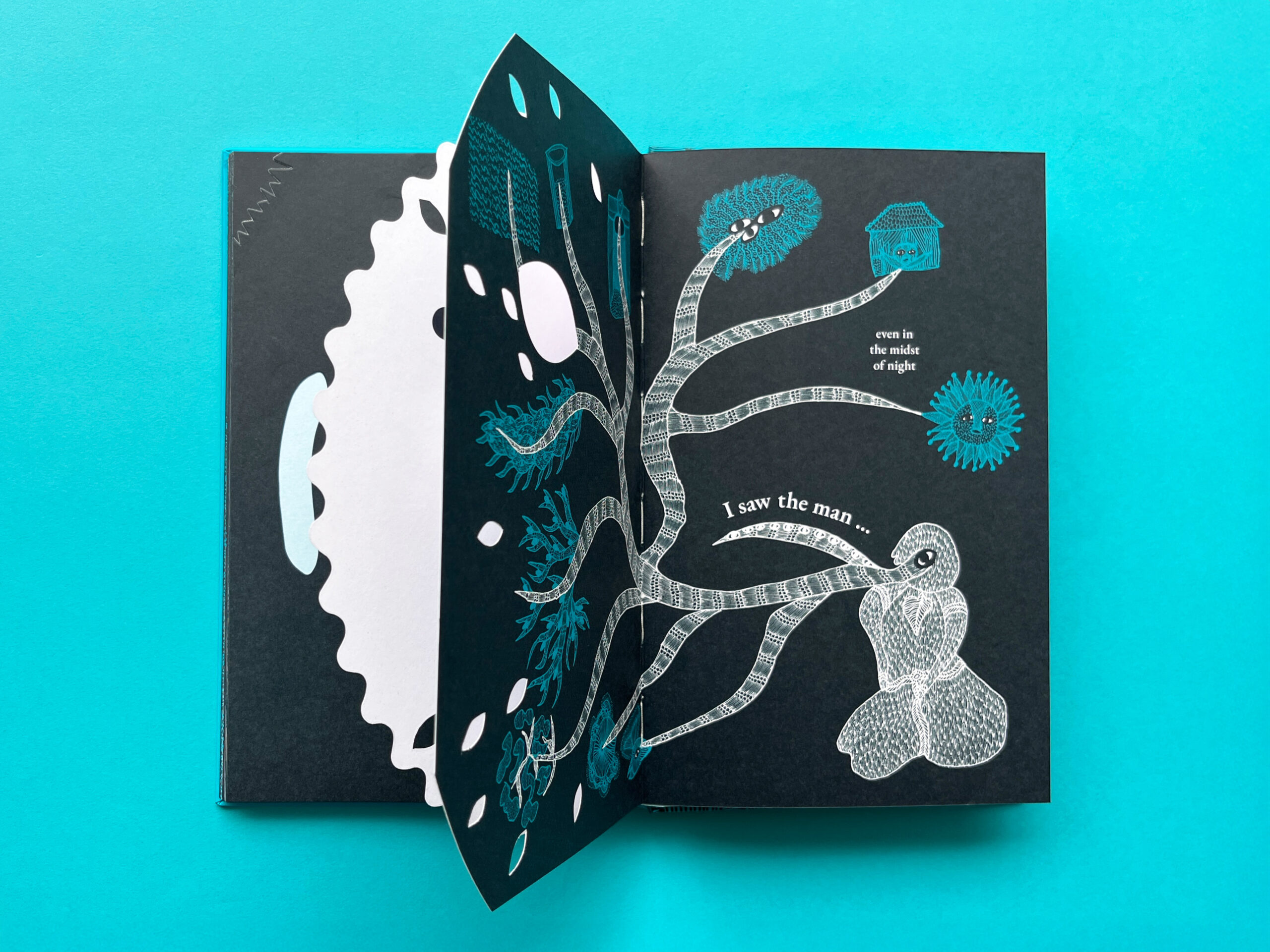
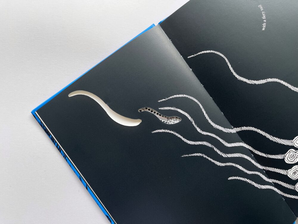
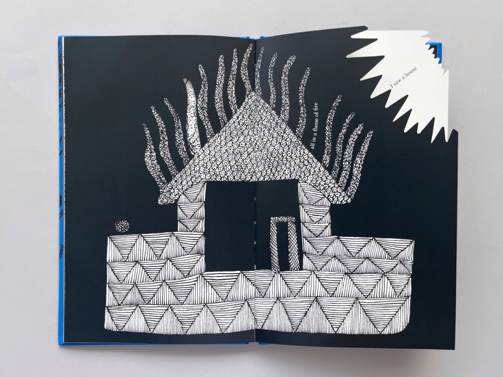
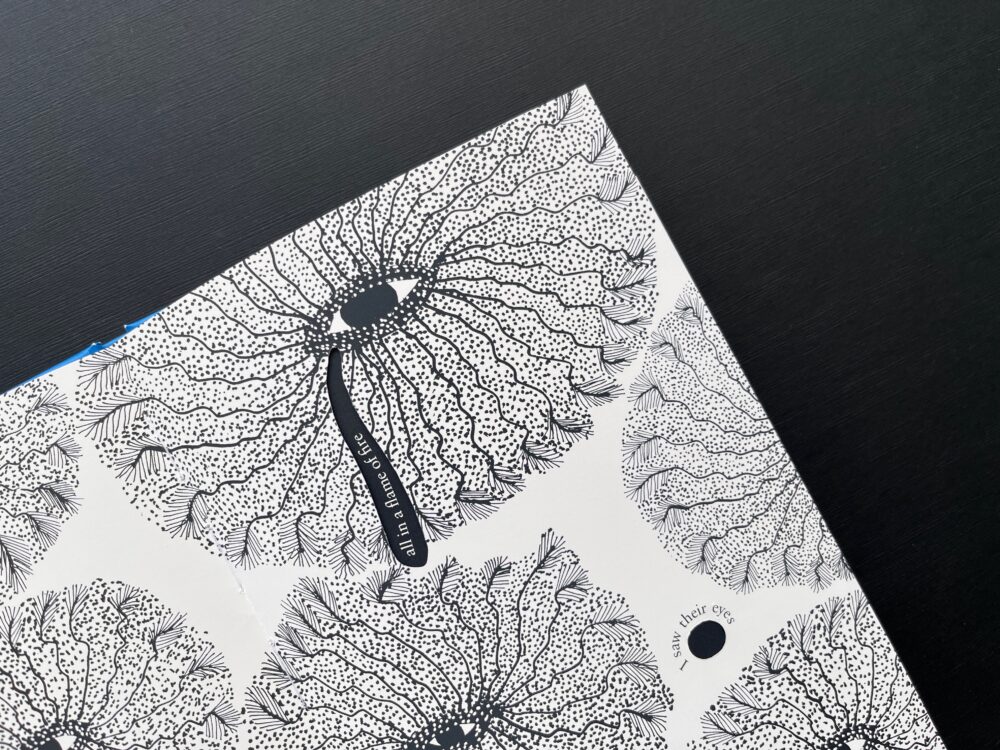
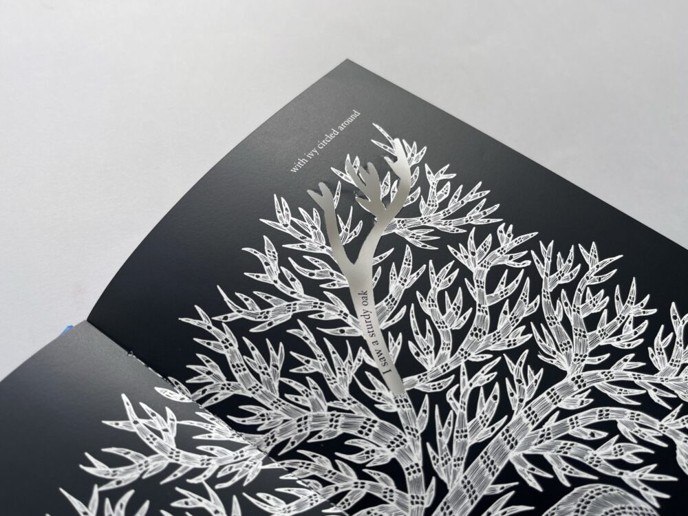
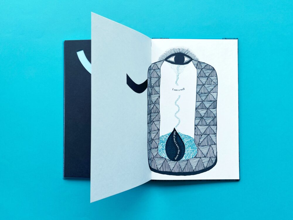
This was when Jonathan realised that the die-cuts had to be organic, and link to the art. While relooking the illustrations, he noticed how they lent themselves to two meanings For instance, the peacock feather could become a comet’s tail. The shape of a tear could also be the one of a flame. This discovery helped him to play with the die-cuts. Eventually he worked out a visual rhythm. The book starts with a simple circle, and other shapes follow, with some being cut into the illustrations.
Different die-cut shapes
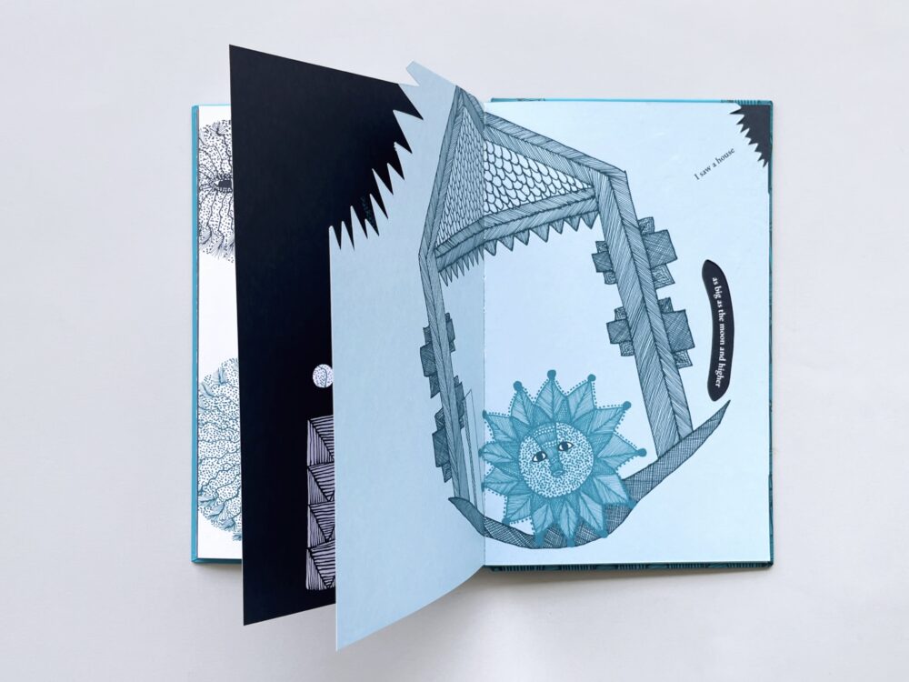
On some pages, the die-cuts are part of the illustrations – even as they frame text that appears on the following page. And when you flip the page, you see details of the illustration on the previous page – which appears almost seamless with the one that is on the flipped over page!
The die cuts when the page is flipped
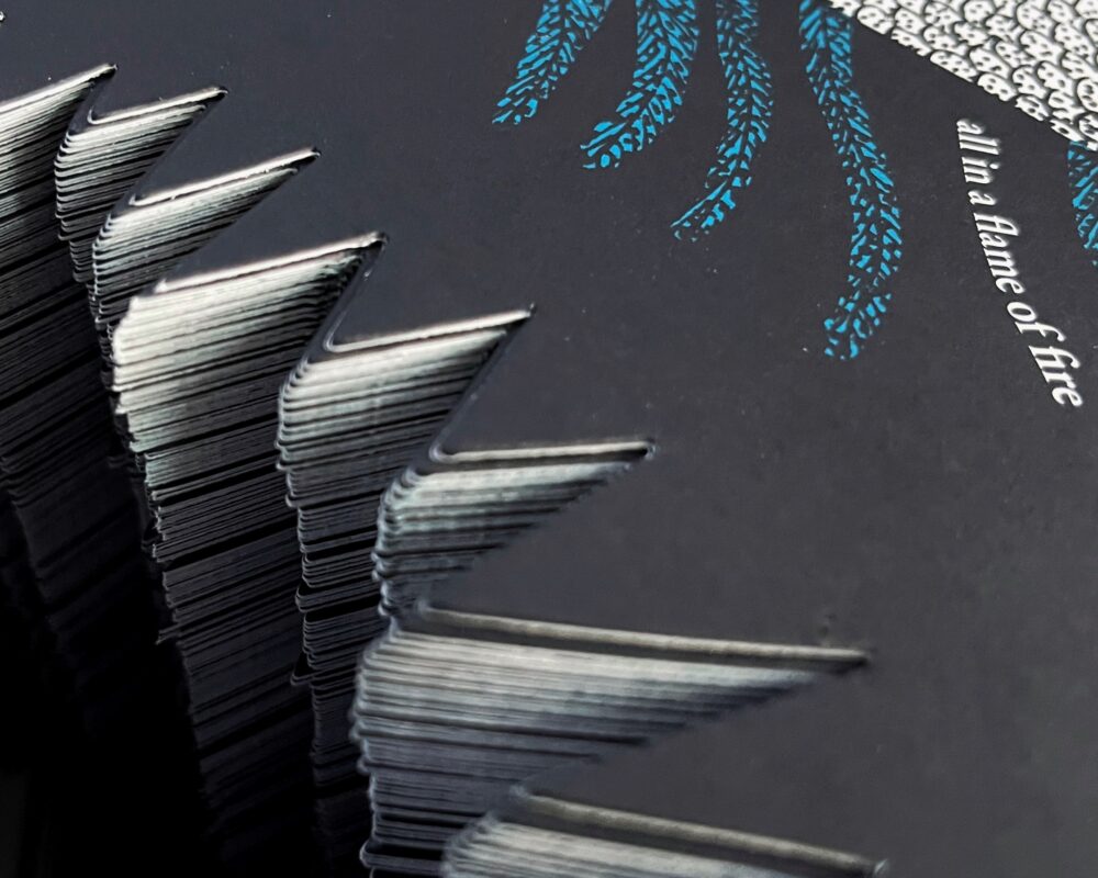
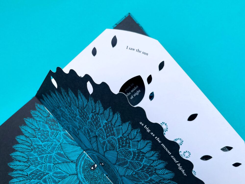
The final design consisted of black and white pages that alternate across the book – which added a further dimension to the play with meaning that is at once concealed and revealed.
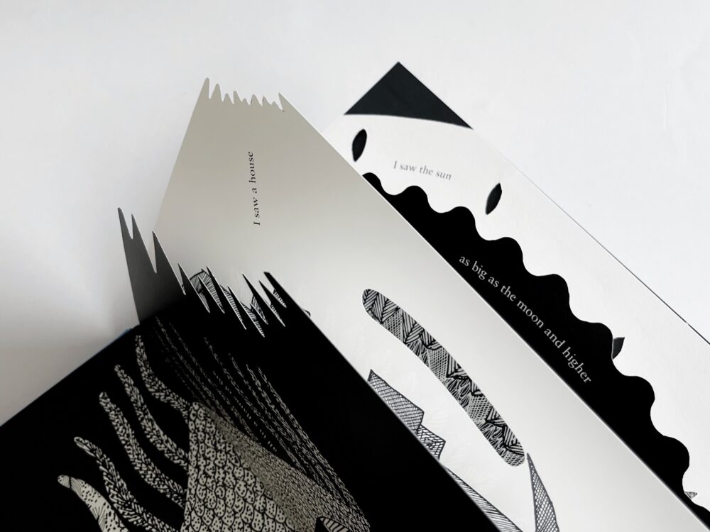
The alternating black and white pages
Then came the production stage, and here a new challenge arose. Up until that point several different dummies were made by hand. But this obviously was not possible, when 3000 copies of the book needed to be printed. At the time, Tara printed books in China and so the pre-press files had to be as exact as possible, so that at the folding and binding stage, the die-cuts would not shift. The printers were competent and reassuring – and when the advance copies from China arrived, there were no bad surprises. The book was beautifully done.
The use of die-cuts on the cover and inner pages
The Redesign
The decision to re-visualise I Saw a Peacock was made when a UK book distributor suggested that it would be good to put it back into the market. It had been out of print for a short while. Looking the book over closely, Gita Wolf decided to act on a few things that had been niggling at her: the cover needed to be relooked, and some changes in the die-cuts were needed for the verse to read better. Readers typically read from left to right and top to bottom – and keeping this in mind, the placement of the text needed to be reworked on some of the pages. She also wanted more depth and colour to be introduced but subtly, so that the overall tonality would be harmonious. She asked me if I would like to take this on. I did!
The first thing I did was to familiarise myself with the poem and its design. Arumugam, the head of production at Tara Books, helped me understand how the book was produced the first time around, and pointed to the sort of changes that could be made, without disturbing the existing design. He suggested that the die-cuts could be made slightly larger to accommodate the text on the following page. Should there be a slight misalignment, this would help take care of the problem.
Keeping his suggestions in mind, I started making tweaks to certain spreads of the book – slight edits that made for better reading. Additionally, I reworked the typography by simply choosing a similar font with multiple weights to establish typographic hierarchy.
The use of a larger and bolder font to create emphasis on the last two lines of the poem
I also played with the space of the page and tried to simplify some of the die-cuts. I made sure that the remade shapes integrated with the art work. In discussion with Arumugam and Gita, I ensured that some of the shapes could be simplified to avoid challenges in production. Carrying out these changes, I learned that design decisions cannot be made page by page in serial fashion. Each spread of two pages was interlinked with the other, and so changes done on a spread would affect other pages. This made the re-design a rather extensive challenge.
Editing the die-cuts
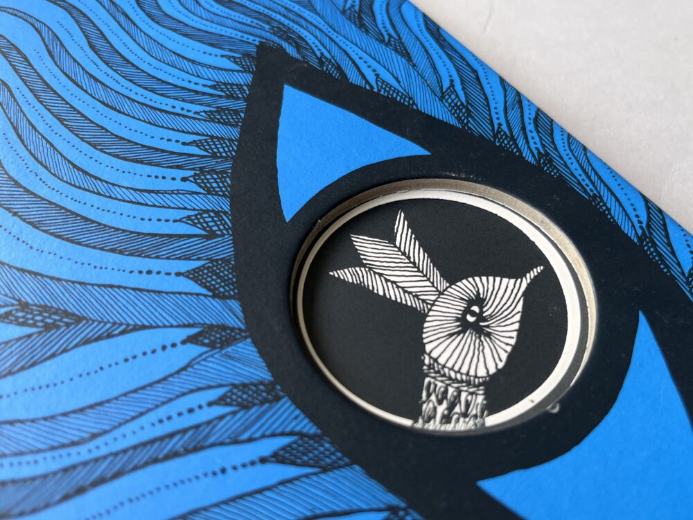
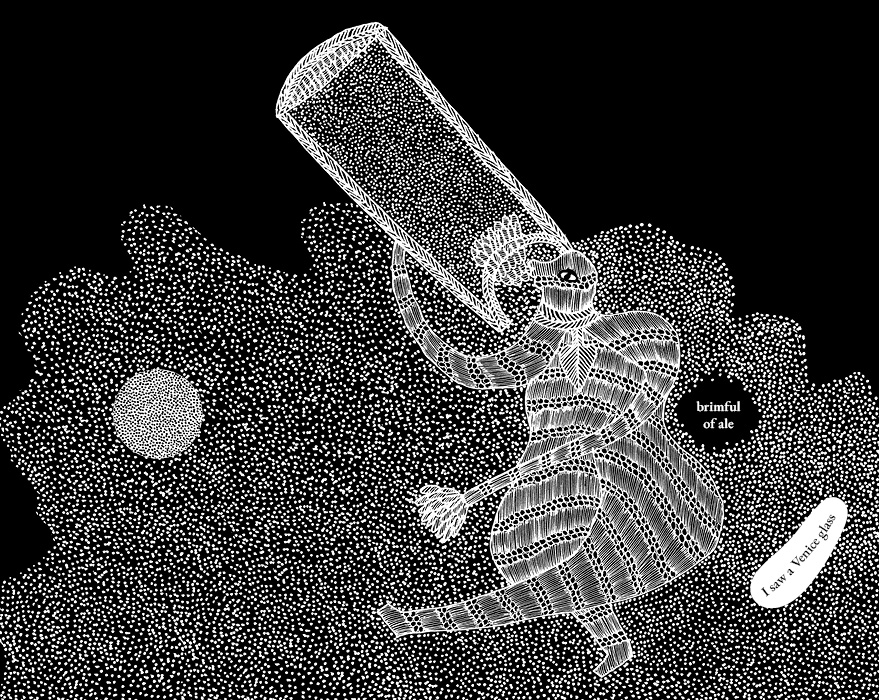
Another thought was to introduce blue text with a white background to create emphasis. While implementing this idea, I realised that it interfered with the alternating white and black coloured spreads. I had to take a step back and think of another alternative.
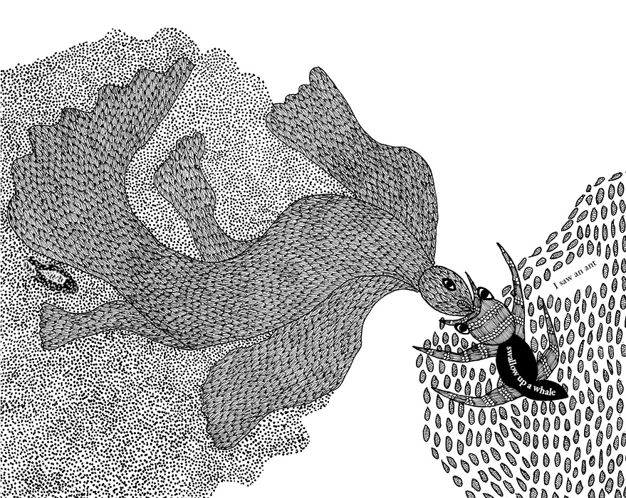
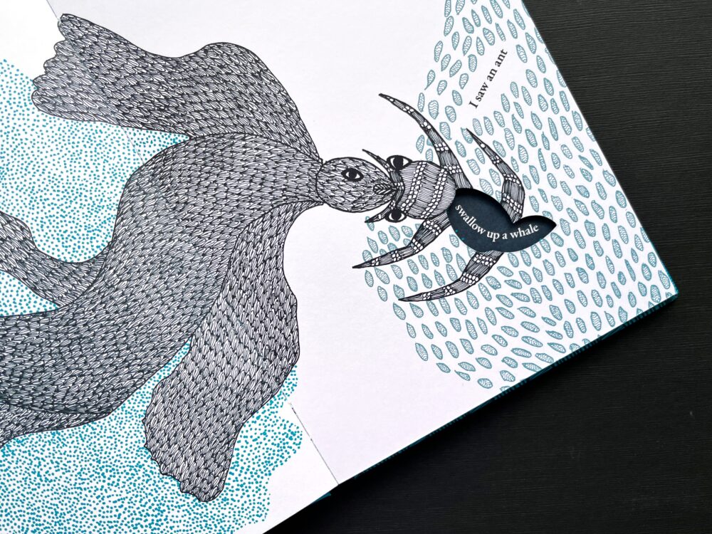
As I worked on the pages I came across the spread, ‘I saw an ant…’ Suddenly I saw the potential to work with figure and ground, a Gestalt theory of perception. I felt that a figure (the ant) can be distinguished from the ground (the rocks on which the ant sits). I played around with the opacity of the black.
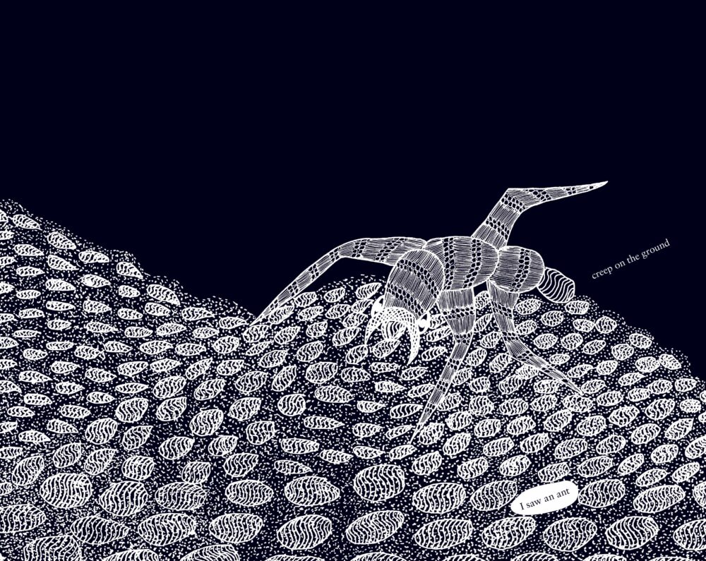
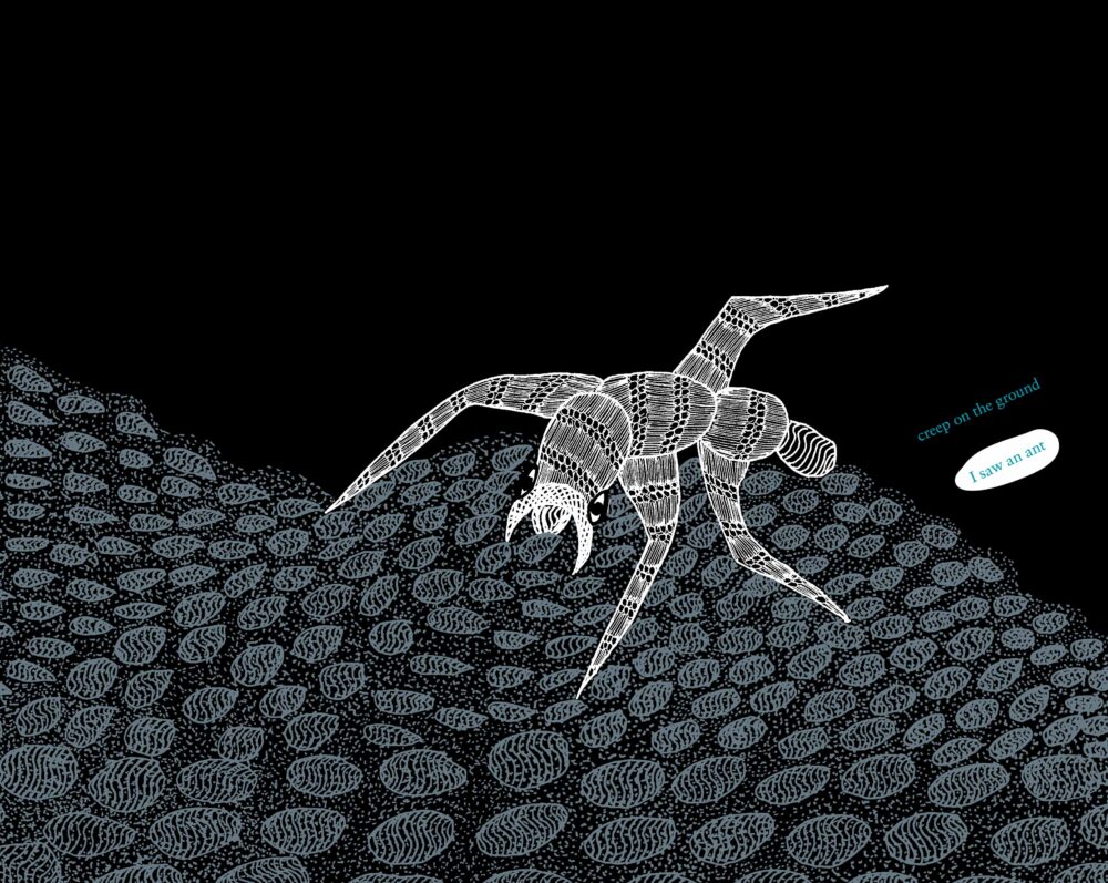
Playing with figure and ground by creating a separation between the layers in the image
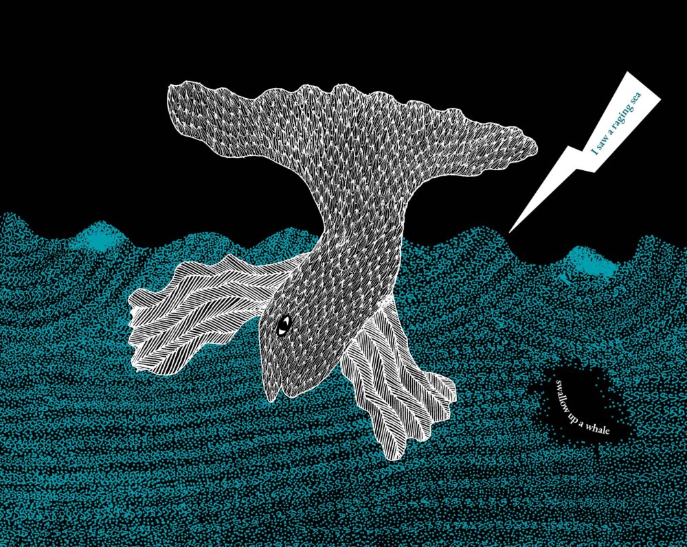
I worked with two spreads to test this kind of treatment and this was when it struck me that adding blue to the artwork instead of the text might work. This would add another layer of meaning that unfolded from the image and make the most of the blue ink. Once I had the basics in place, Gita and I worked on fine tuning the colours in a way that would maximize the effect of colour shades using percentages of black and blue. We decided to go with two special colours – blue and black. All the effects are achieved with just these two primary colours.
For the first edition, since the book had a single colour, a spot colour was used. It was a special black with an underlying hint of blue printed on coated paper. A spot colour is solid ink that is premixed to ensure consistency – unlike process colours that use cyan, magenta, yellow and black (CMYK) to achieve a range of colours.
This time two spot colours would be used for the book – a special black along with a peacock blue on a thicker uncoated paper. An advantage of using spot colours is that they can be mixed with one another at varying ratios to create a range of possibilities, increasing the scope of using colours. A vast range of shades could be created by mixing the black with the blue which yielded a richer look to the art. Essentially, I ended up artworking, separating the layers and playing around with the colours.
Adding the blue
The book was printed locally, in Chennai city. Since there were a lot of steps in the production, Arumugam had to find the right press to carry it out. When he did, we started the production. A black and white dummy was prepared – and I realised that some things had to be tweaked before printing. A digitally printed coloured dummy was also made and this gave us a sense of how the coloured images would look. I had to go back and forth, between the dummies and the files on my computer to make sure that all pages were as we wanted them.
After this, we had to create a file that would help prepare the plates for printing on an offset machine and to test how the colours would look when printed. In the initial set of proofs, pages that used solid black looked somewhat pale and had pinholes on them. This was because of the uncoated paper – which has a tendency to absorb ink more, as compared to coated paper. Arumugam proposed that a separation be done, for all the places that needed an extra layer of black. After this, another set of plates was created to print black all over again on some sheets. A two-coloured book was printed with three sets of plates – one set for blue and the other two sets for black to ensure a deeper and richer colour.
Initial proof with a paler black and pinholes and the next set of proofs with an added layer of black
Printing was only the first step. The book had to be die-cut, folded and bound, and each step had to be executed to perfection. Usually a printing press takes care of all the processes. The press Tara relied on offered only printing. The sheets had to be transported to the place that did the die-cutting and from there the sheets went to another place for binding. We were constantly on the move, between these various work places, to ensure that all went well.
Die-cutting posed the biggest challenge – the cut had to be perfect to ensure that the image or text on the following page aligned in the way it was meant to, with the cut. Folding was not easy. It had to be done without damaging the die-cut areas of the book. A wrong fold would misalign the die-cut. Machine- folding was therefore replaced by hand-folding – since it would likely damage the cuts in some cases. The machine was used only to score the paper. Placing the end sheet, pasting it and matching the die-cut to the cover – all these are critical steps. Since each step of the process was supervised – from creating the files digitally to binding and finishing, the result came out as we hoped!
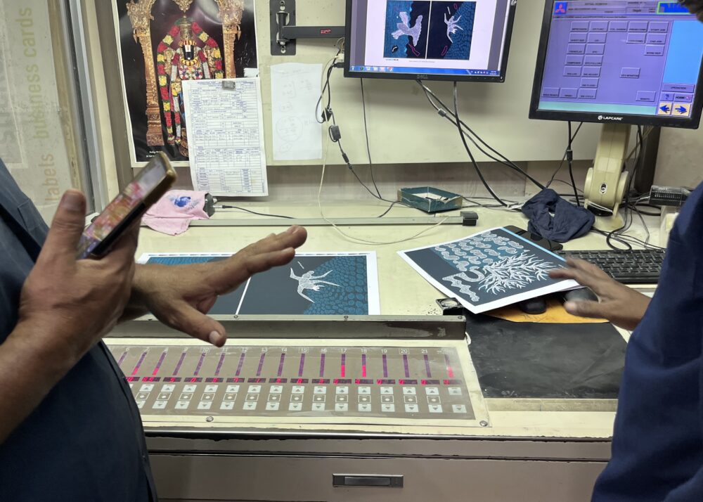
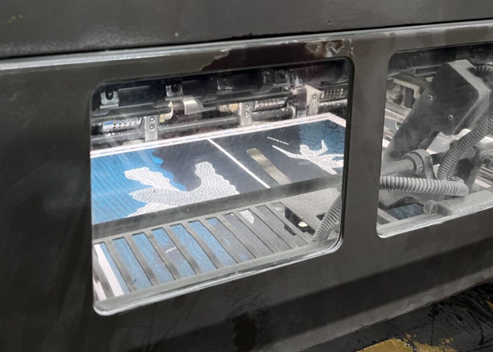
At the press; adjusting the density of the blue
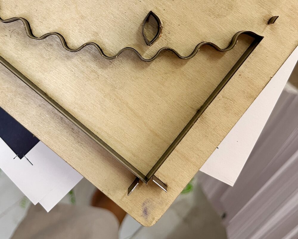
The dies and die-cutting
Through this experience I got to apply what I was familiar with only in theory (being a fresh graduate). Be it technical things such as using spot colours and them being mixed to achieve diverse colour options, creating accurate keylines, separating colours, how the density of ink is checked and controlled on an offset machine – I learned a lot, observing and in the doing. I was fortunate enough to visit the printing press at each step and watch the entire book come to life. The most important learning happened through rethinking the design process, solving problems that arose when I had to carry out changes, and to keep in mind that these were being done for a book already celebrated for its design – this proved to be the biggest challenge and made for the greatest learning.
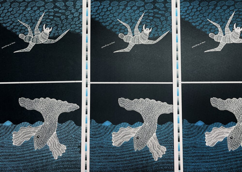
Final spreads from the book
Disha Naik is a graphic designer from Mumbai, India. Her interests lie in book design, typography, lettering and illustration. Apart from creating a narrative by means of design, she particularly likes to explore how it can be integrated with the production process while conceptualising a book.
No Comments