

30 May Typography as Illustration? Nonsense!
By Gita Wolf
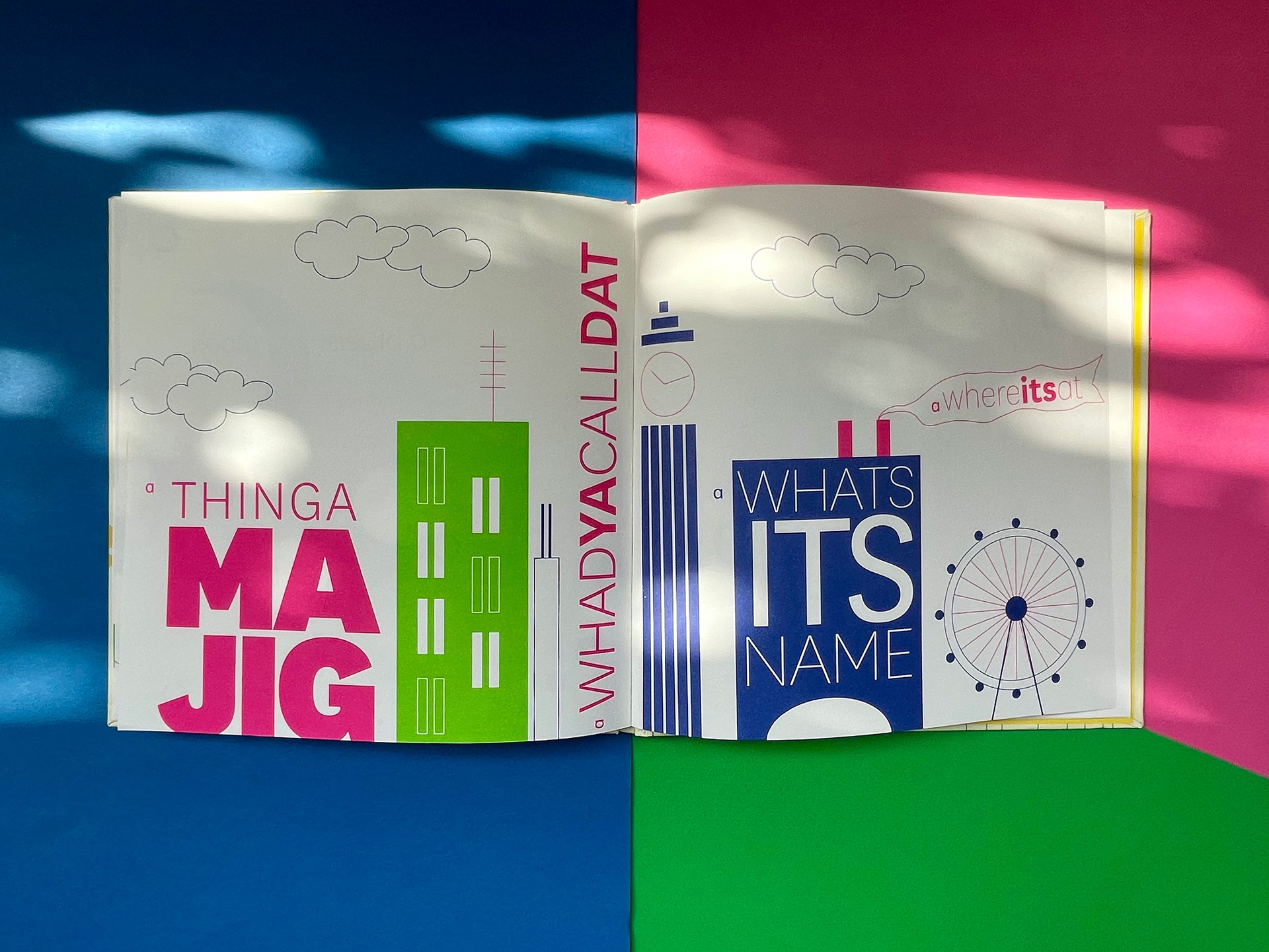
“If the thingamajig does whatsitsname then you can watchamacallit the dingdoodad.”
– Anushka Ravishankar
“I’m rather emotional about the bravery and courage of Tara taking this on.”
– Rathna Ramanathan
The Original
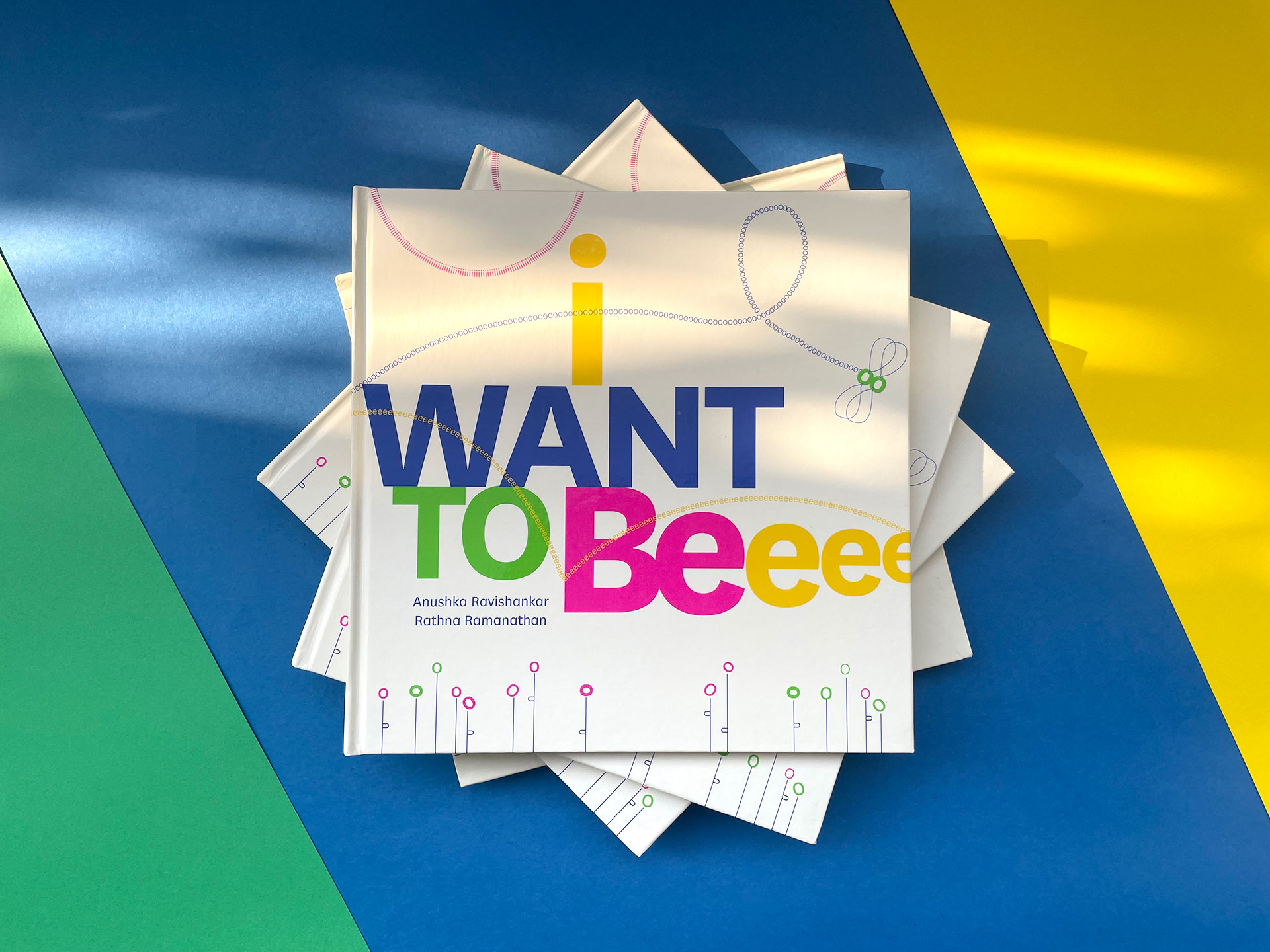
There are some books which remain stubbornly ahead of their time, regardless of how much time has passed. I’m proud to say that our latest release—I Want to Be—falls into this category, as cutting-edge in its present avatar as its earlier version Anything But a Grabooberry was in 1998.
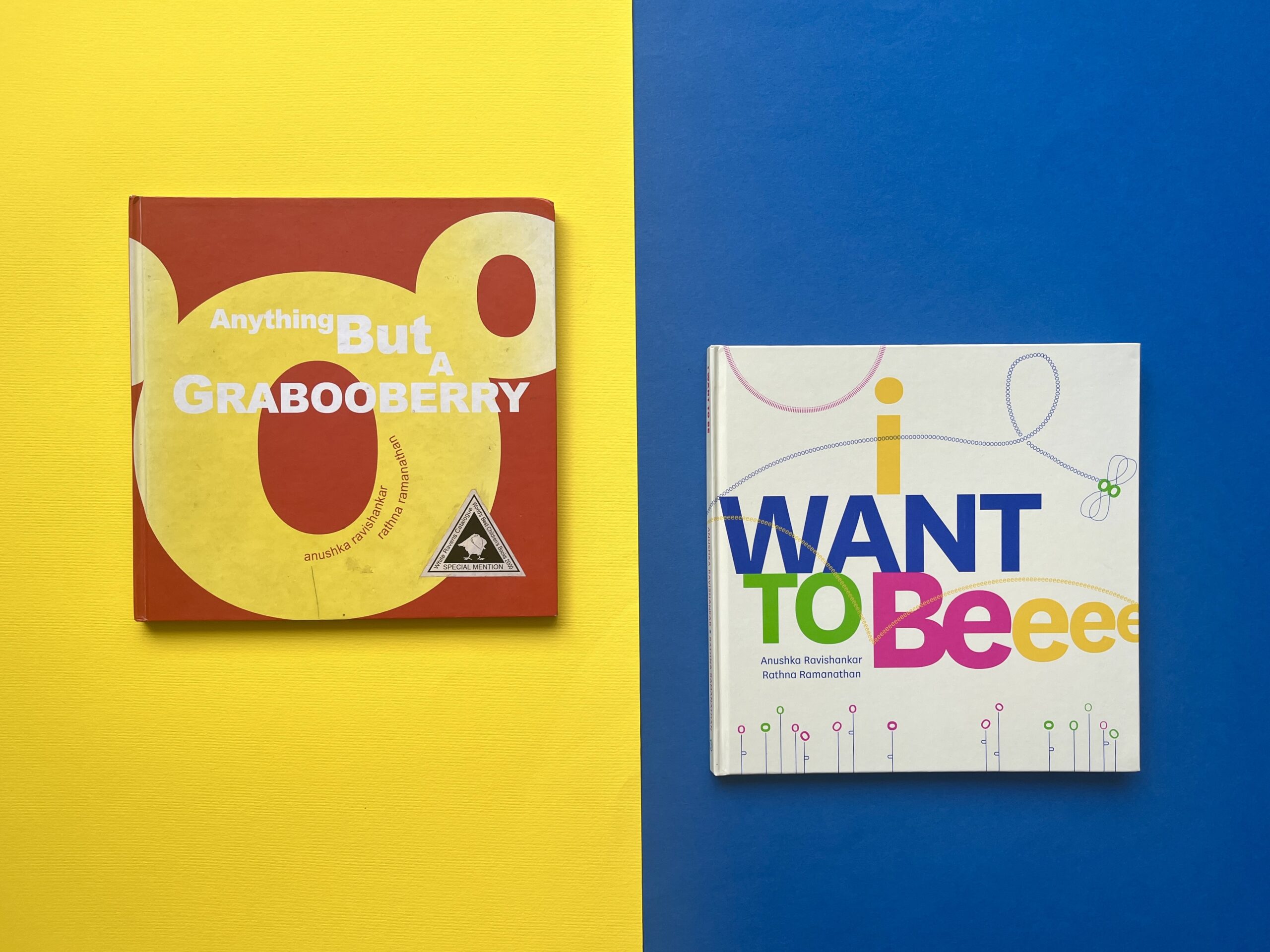
Same but different: Anything But a Grabooberry (1998) and I Want To Be (2023)
When we first published the book, we didn’t overthink it. Our favourite author Anushka Ravishankar had come up with a nonsense verse story about a child who fantasised about being many things—the only thing she didn’t want to be, for some reason, was a Grabooberry. The poem was great, vintage Anushka. We did wonder idly what a Grabooberry could be, but let it pass. When our young designer at the time—Rathna Ramanathan—offered to illustrate the poem, we were delighted… and left them both to it. Anushka and Rathna spent a lot of time closeted together, and at some point, there was talk about testing what they had done with kids.
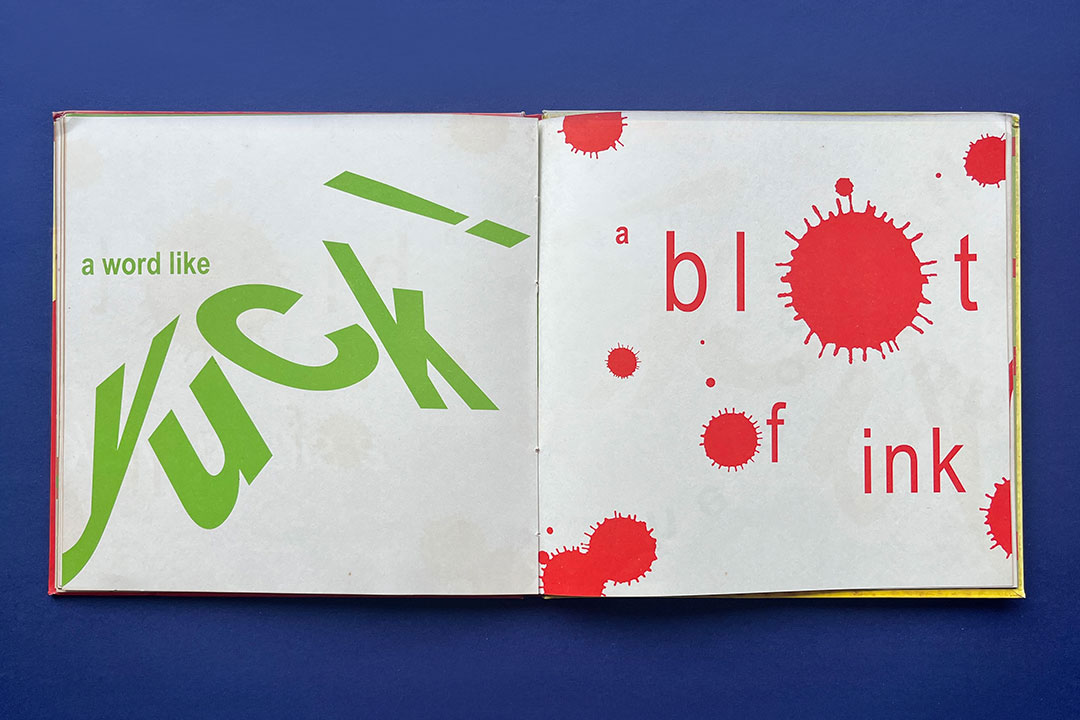
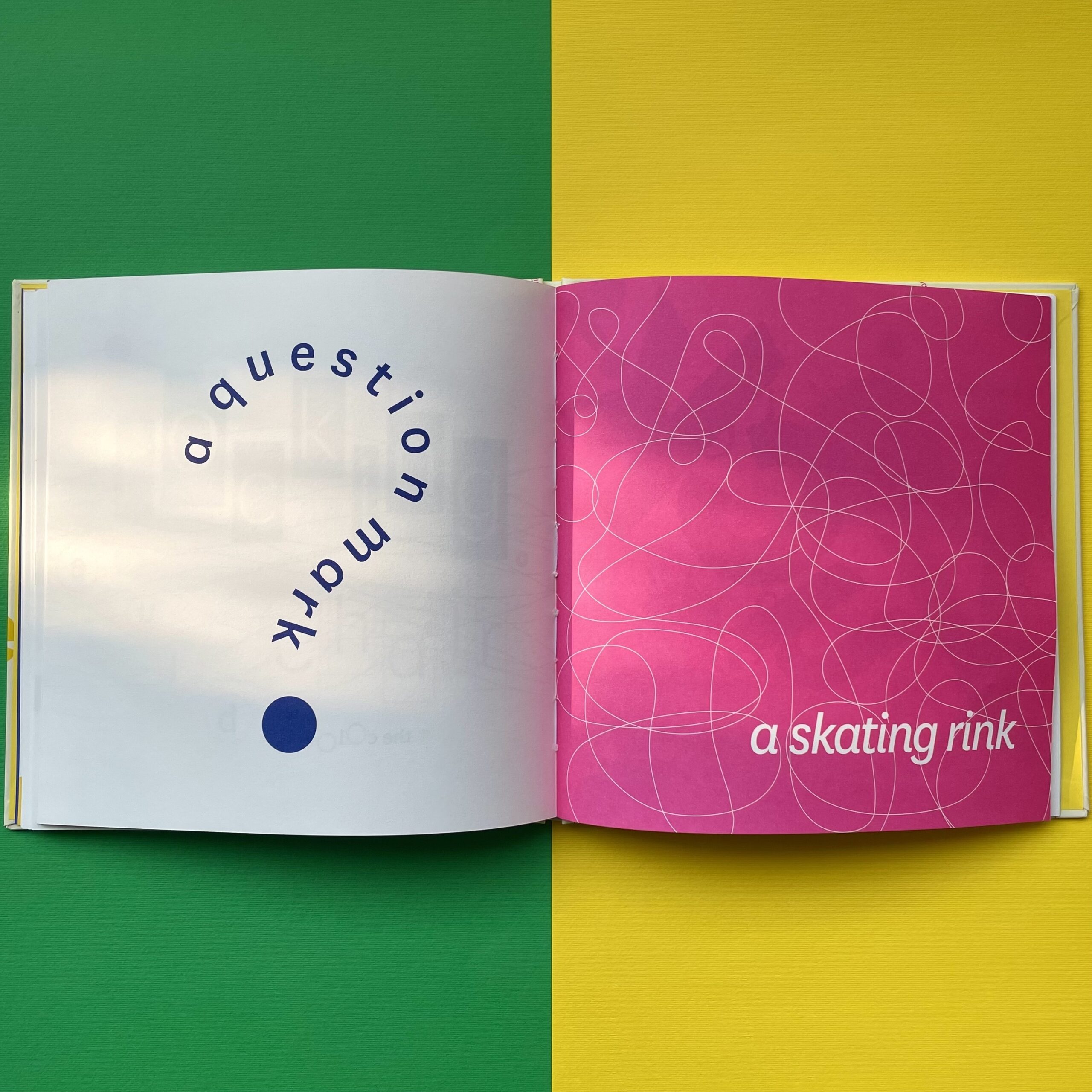
But nothing prepared us even remotely for what Rathna ultimately came up with. She had brought the poem alive entirely through what could loosely be called calligrams—arranging text visually to form images that expressed its meaning. Sometimes literally, at other times tangentially, and then again sometimes completely contradictory—all of which added layers of meaning to the words.
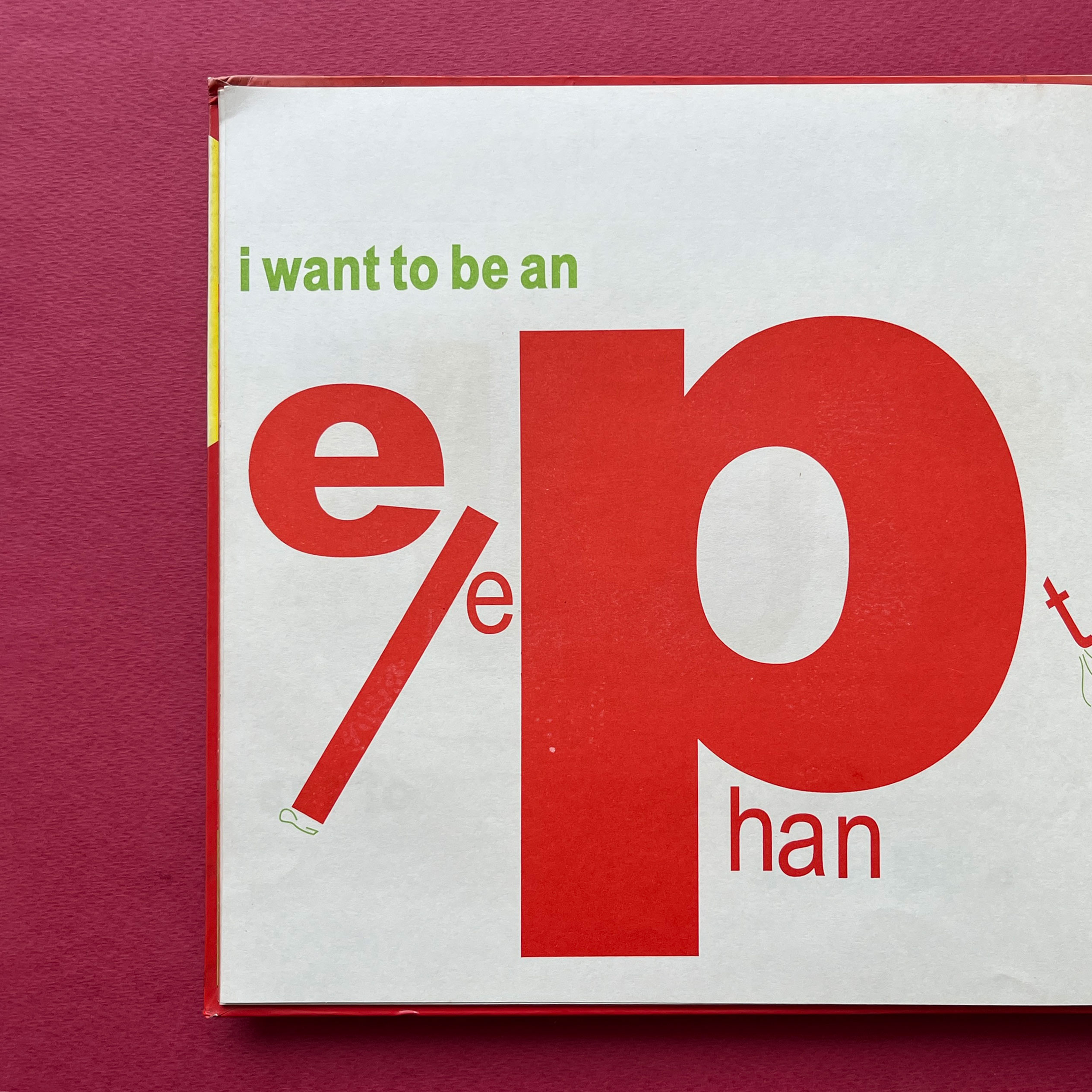
Calligrams from Anything But a Grabooberry
She’d brought images, sound, colour, texture and a whimsical voice to the reading experience. We’d seen posters using type play and calligrams; but to carry it through a whole book meant for children, while making sure it communicated and kept the narrative tempo… it was extraordinary.
Sounds and shapes: A spread from the original edition
Managing to read the whole book through ‘correctly’ was curiously satisfying, like solving a challenging puzzle. And we were adults—what would children make of it? Rathna and Anushka had, it turned out, tested it on several age groups and taken in the feedback to modify what they were creating. Always up for experimentation, but keen that it communicate as well, we were satisfied that the book would work and rushed to publish it. The only thing we added—just in case—was a short note called ‘What This Book Does’.
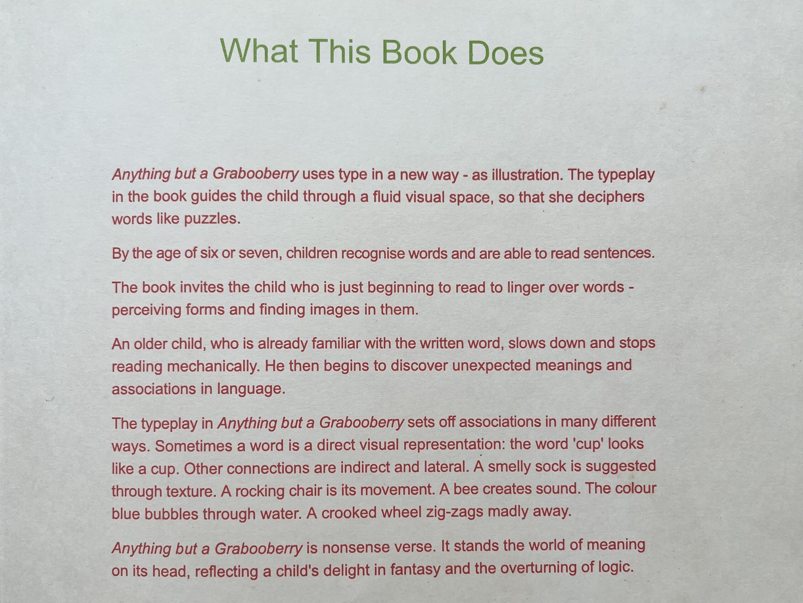
A short note on ‘What This Book Does’
So the book was printed and sent into the world. Some people thought it was brilliant, others didn’t quite get it… that’s the way it goes, in publishing, especially when something radical appears. We did get a White Ravens award for the book, and it featured as a signal Tara title at an exhibition we curated at St Bride’s in London in 2007. But to be honest, we were a bit disappointed with its reception: not because we seriously expected to sell thousands of copies, but because it did deserve a bit more recognition as a new impulse in children’s literature. We would have loved a discerning critique of the book, which acknowledged what had been done with typography as illustration, the difficulty in achieving this and perhaps pointing out what could have been done better. That was not to be. But the book did sell, slowly, over time, and finally went out of print.
A New Edition
It didn’t go out of our minds, though. Decades passed but it continued to remain a personal favourite; until now, 25 years later, its time has come again, though in a slightly altered form. So what has changed in the meantime? Quite a lot, as it turns out. Our core belief in experimentation that communicates hasn’t changed, but we have matured as publishers and editors, more confident about what makes a book work as it should. We’re able to evaluate an old project and see whether it’s still relevant or simply past its time. Re-publishing decisions need to be made carefully by a cash-strapped independent publisher. But there was never any doubt about Grabooberry. It remained one of a kind. So when the time was right, it became a question of figuring out what worked and what we could do differently. A second chance is a publisher’s dream.
For a start, we felt that the title, and the idea of the Grabooberry itself, needed to be rethought. It seemed to be an inside joke, a non sequitur which confused rather than enlarged the plot. It could be done away with safely, keeping the basics intact. Luckily, Anushka saw our point and got to work on changing the poem, editing out some verses and adding new ones. It was reborn as I Want to Be.
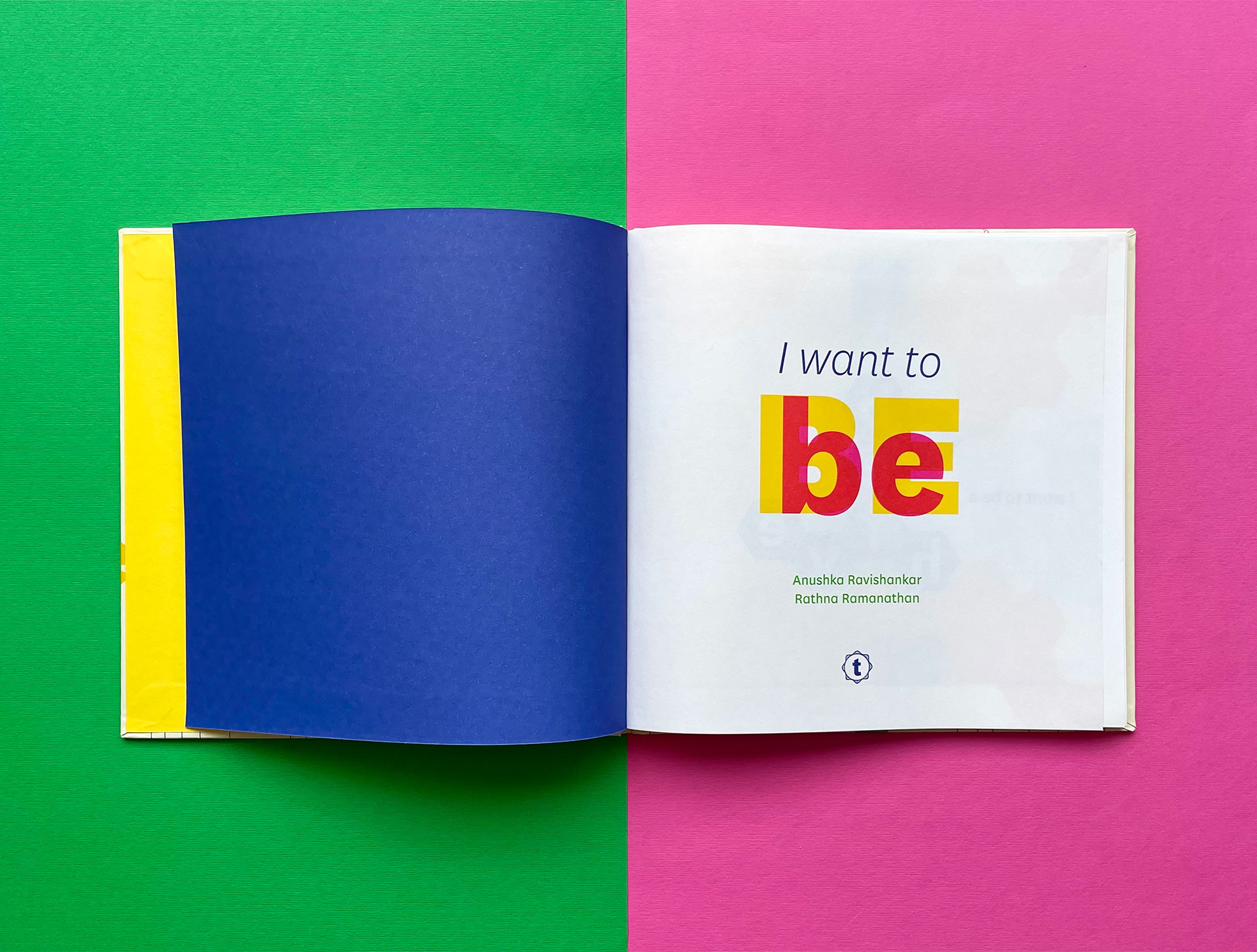
A new, reimagined edition: I Want To Be
Meanwhile, Rathna was equally excited about putting her hand to an old favourite again and seeing where it could be taken. New images and colours followed. We toyed with the idea of printing the book on a letterpress, for those vivid colours and impressions, but gave it up as too expensive. The new colours were something that Rathna was keen on, so we settled on special inks—not cheap, but nothing outrageous.
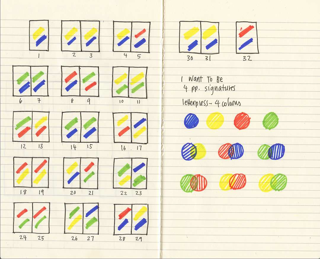
Rathna’s colour storyboard
A bold palette with special inks
It was a joy to hold the final book: the resurrection of a brilliant project which took the experience of reading to a completely new level. It still slipped through all known categories, and confounded our sense of children’s literature and illustration—and we relished that. An age-defying, genre-defying piece of work. Even though the voice was that of a whimsical child, the whimsy, the logical yet absurd verse, and of course the calligrams, actually made it a book that could be savoured at any age. Unfortunately, none of the international publishers we sent a sample of the book to—in the hopes of a co-publication—saw it that way. It was too odd and risky a project. Disappointing, but it hasn’t dampened our conviction one bit.
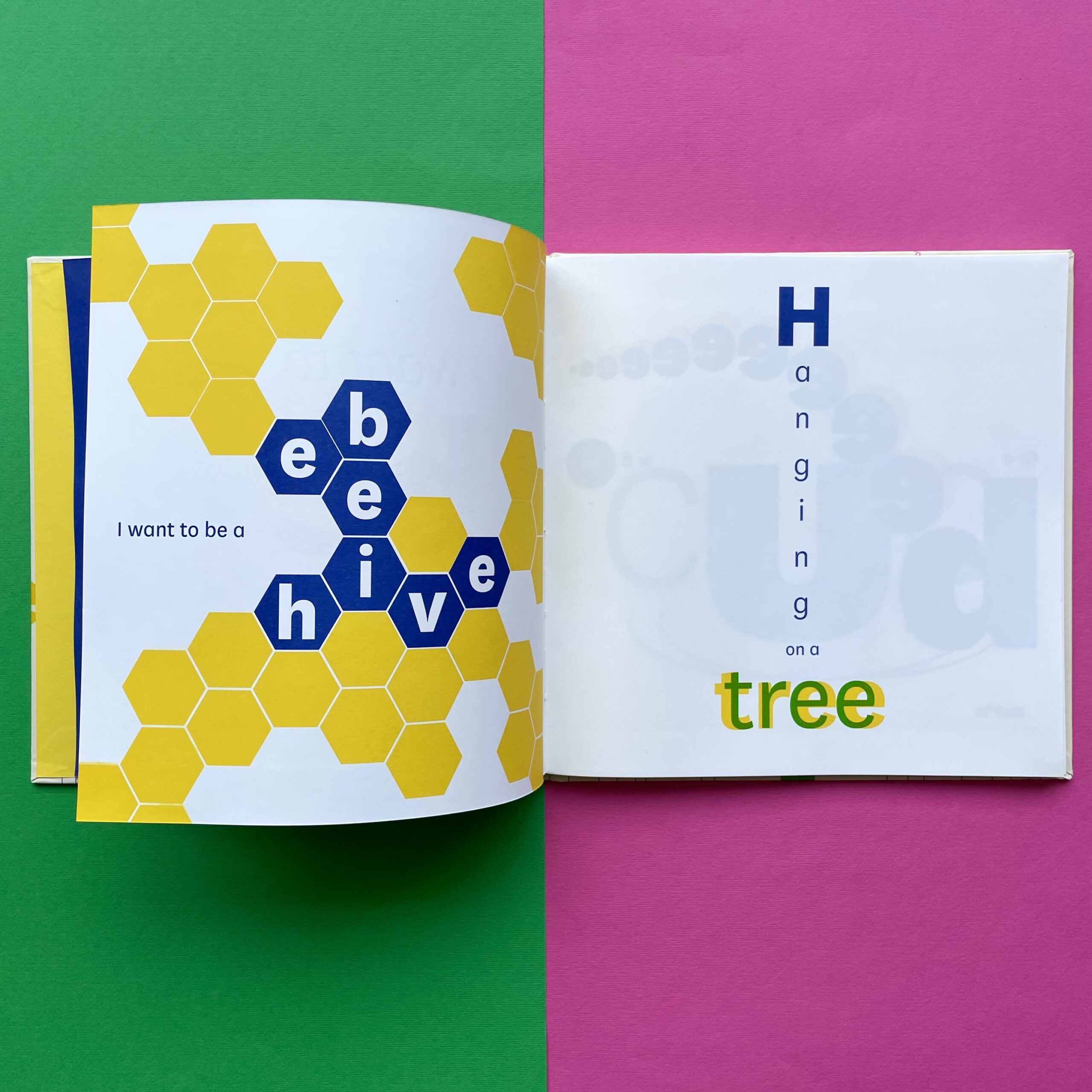
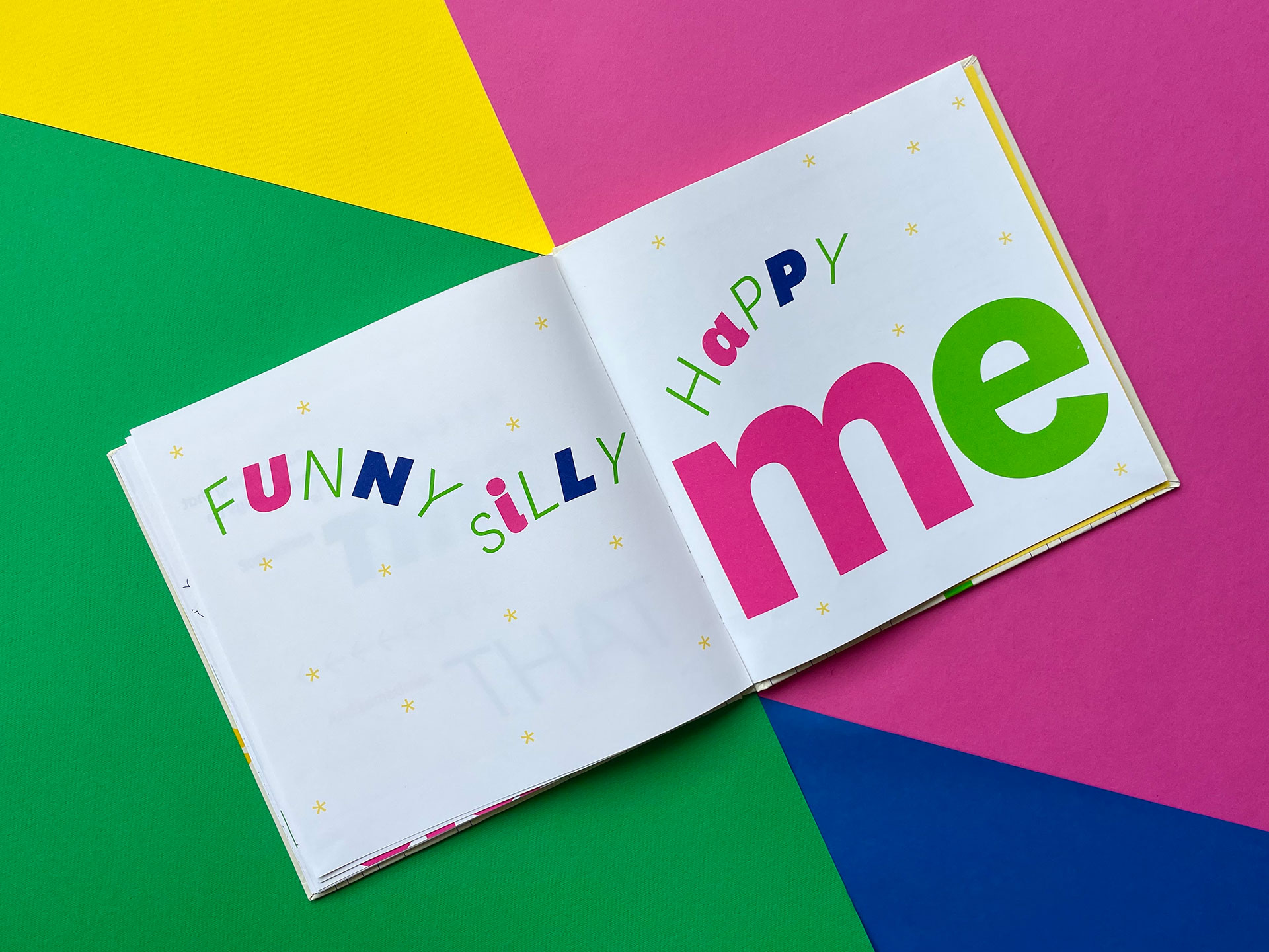
With the experience and confidence we’ve gained, we can now state clearly what exactly this book does: basically, it’s a word puzzle which invites children to recognise letters and make connections between the meaning of a word and its visual representation. It’s a new way of looking at language and scripts, a whimsical take on the building blocks of the alphabet and a tangential approach to recognising objects. Words become objects in all kinds of ways. Collapsing the space between words and pictures—as the word illustrates itself—the book makes the case for lateral thinking. What’s not to like?
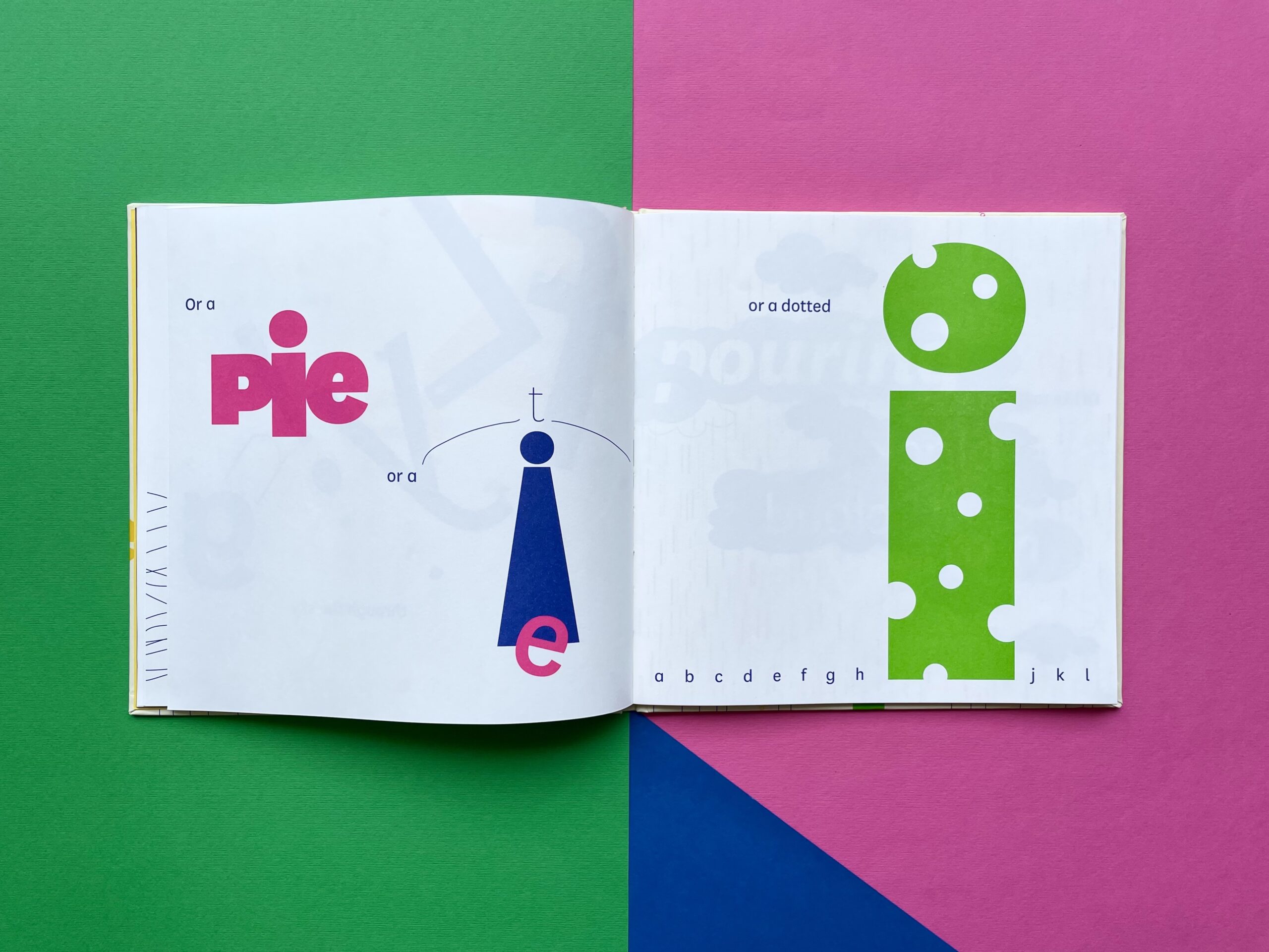
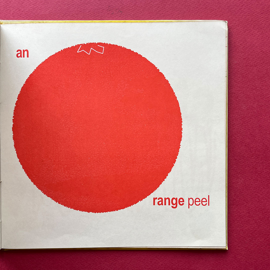
A pie, a tie, a dotted i: Words illustrate themselves
We think children, parents, educators, graphic designers, word game enthusiasts, and generally all non-serious people will take to this book. Our readers tend to be quite discerning.
And meanwhile, the change that has come over the world—and the publishing landscape—works in our favour. We can now talk to our readers directly and no longer need to depend on a shrinking review space for children’s books. So this is the story of the book for you to enjoy and, as a bonus, we asked Anushka and Rathna to talk about their perspectives.
The creators of I Want To Be: Anushka Ravishankar and Rathna Ramanathan
Anushka Ravishankar
What’s the origin of this book? Which came first, the images or the words?
Rathna wanted to do a book with typographic illustrations, so I remembered this poem I had written called Anything But Me, which referred to all the things the child narrator wanted to be. I thought, because it had so many things in it, it would lend itself nicely to Rathna’s project. But the original poem was too long and was not really written for a book, so it went through many changes. Some of the objects and ideas listed were abstract and some of them were visually similar, so those were changed. The rhyme in the original poem suddenly shifted, both metre and pace, so that bit was completely removed. But one of the major changes was conceptual because the idea of a child not wanting to be herself was judged to be kind of negative! In the process of altering that, the idea of a nonsensical ‘grabooberry’ came up. Anything But Me became Anything But a Grabooberry. The new edition is closer to the original, and shows the child wanting to be many things other than herself. But in the end she knows she is she and is happy with that too. So the actual process started with the written verse, but the verse kept changing to keep up with the typographic excursions of Rathna’s imagination.
A happy ending: The final spread of I Want to Be
Were you surprised at what Rathna came up with?
I was delighted at the type play and yes, very surprised. Some of Rathna’s interpretations are really astonishing and exhilarating!
So you both tested the book out with young readers. What happened?
The young readers didn’t seem to struggle as much as adults did with reading the text. Of course, to be able to keep up with the typographic gymnastics requires a certain level of comfort with reading. But once they figured it out, they really caught the spirit of it and didn’t waste time being puzzled or perplexed.
What’s the difference between the earlier version and this one?
The framework has changed quite drastically. With the exit of the Grabooberry, we needed an idea to anchor the poem and give it a reason to exist. The Grabooberry also provided a refrain and a natural ending. So the challenge was to push the poem to a climax, without using that nonsensical crutch. I would never have been able to figure it out without your editorial feedback. I wrote some duds in the process and you guys called them out at once, which is the best thing an editor can do for a writer!
The escalating nonsense at the end seemed to give the poem the escape velocity it needed. The final verse then brought it back to earth. It’s hard sometimes to judge one’s own writing, especially when you can’t fall back on logic, so it’s a real privilege to have editors one can totally trust. .
Escalating nonsense: An excerpt from the concluding verse
When we showed the book to several publishers in the English-speaking world (a translation is impossible), they all hesitated, even though they thought it was brilliant.
What can I say? People underestimate children. They think they are doing children a favour by giving them predigested and easy-to-digest fodder for their minds and imaginations. I guess they judged the book to be too difficult and sophisticated for children. I find more and more that children are being treated like infants. Teachers become entertainers, writers become storytellers… while actually, children are perfectly capable of listening to words and understanding complex ideas, if only we would let them.
Rathna Ramanathan
What set you off on this typographic track?
I was reading about typographic play at the time and doing some research about different ways one could bring sound, image, colour and voice to a text. We had designed Tiger on a Tree and had great success. I wanted to take this text a bit further because every time I read it, all sorts of images jumped into my head that were not illustrative. I remember Anushka and I having a chat about type play and her mentioning a text that might be good for it, so I would say it was conversation that led to the choice of typographic illustration. And an author who was excited by typography as much as I was!
What does creating typographic illustrations involve?
Whilst the text and the book come across as playful, it is quite technical. To create typographic illustrations, I find it is best to use a limited typographic palette—so all our type play books at Tara use only one typeface. This is the starting tool. I do a lot of tests to think about the right kind of character for the book. I chose National by Kris Sowersby because it comes from an Akzidenz Grotesk tradition but is modern and contemporary. So it is easy and bold to read, but also versatile due to the number of different weights.
I see type as a material. Like a pencil which can range from soft to hard, type can range from thin or light to black and heavy. When you’re creating a typographic illustration, you’re thinking and making with type just as you would illustrate with a pencil, shading and adding texture and weight. You’re drawing with type. If you think of type as a toolbox then you can start to understand how it builds associations through movement, texture, location, shape, sound and colour to paint images in your mind as you read.
Would you design type play for kids differently from what you’d do for adults?
Yes, I would. I think with children it was very important to check with them and to design with them. So I worked with young readers, testing early design drafts. Based on their reading out aloud and understanding of the pages of typographic play, words and shapes were adjusted accordingly. This iterative process underpinned the aims of the book, which for me were to enable typography and language to expand aspects of reading, incorporating sounds, shape, texture, movement and colour to evoke the pleasure of reading for young readers.
Typography makes for pleasurable reading
With adults, as with In the Land of Punctuation, I can draw on and hint at world events or familiar images but with children, it is best to link to the meaning of the words and use typography to bring them to life.
What kind of reading experience does it give a child? Why do you think it’s not tried more often in children’s books?
I think many publishers are extremely conventional in their concept and approach to reading for children. We are framed by habit—i.e. letterpress—particularly in European and Anglo-American contexts, where image and word are separated. In Asian contexts, image and word are often combined and there’s an understanding that one need not be one or the other but can be both. We have a more spatial approach to words and images on a page, and you can see this through time—from manuscripts to Bollywood billboards!
I also think that publishers often confuse different kinds of reading—we read for information, for pleasure and for study. When we read for pleasure, we have a bit more space to play with the reading experience for the child. Yet most books designed for children do not take this into account and seem to be very focused on teaching children how to read and how to make it easy for them. They focus on one way of reading which is about study or information, and not about the pleasure of the reading experience.
It’s hard to keep up the type play challenge page after page and build a good narrative. How did you get it to work as well as it does?
I do a lot of storyboarding and use colour and pace to build rhythm in a book. There are two elements to keep in mind—the macro typography, which is the design of the book as an object in time with multiple pages, and how you pace the reader through it. And then micro—how you build this on a page. They must work in tandem. If one of the puzzles was too complex, I would lighten it for the reader to make it easier on the next. When designing a book such as this, you want to balance between challenge and pleasure, so the reader keeps coming back for second, third and multiple readings.
What was it like to test out your initial draft with kids? What did you change as a result?
It was super fun! The kids would turn their heads and read aloud with gusto. I just watched very carefully and looked at where it was a challenge, and then changed that so it was easier to read. I think my favourite page of change was when the kids read ‘I want to bee’ and read it as ‘beeeeeeeeee’, like a flying away bee. I had to add a lot of ‘e’s to keep up with their reading!
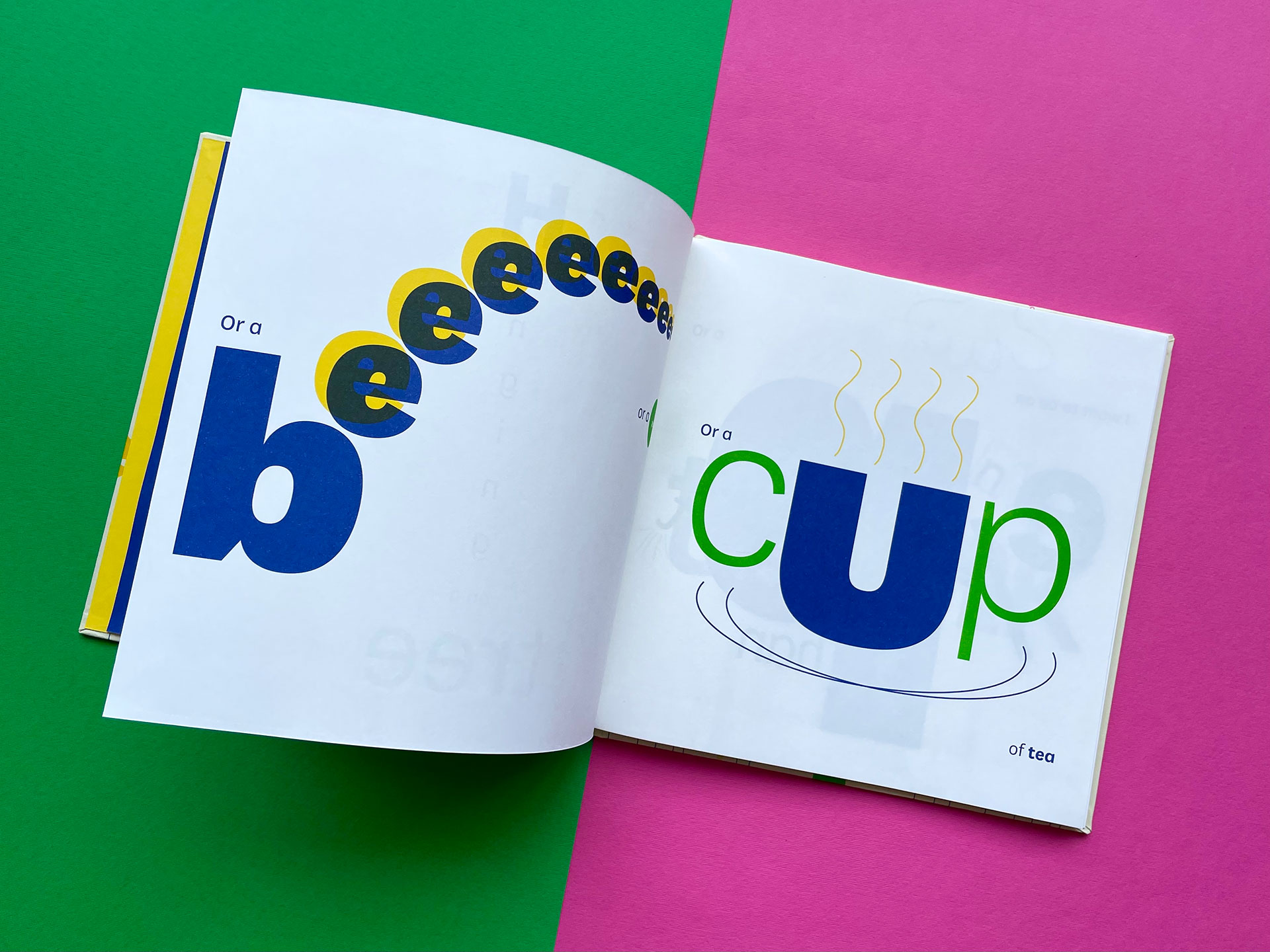
Reading out loud: Beeeeee
What’s the key to the new version?
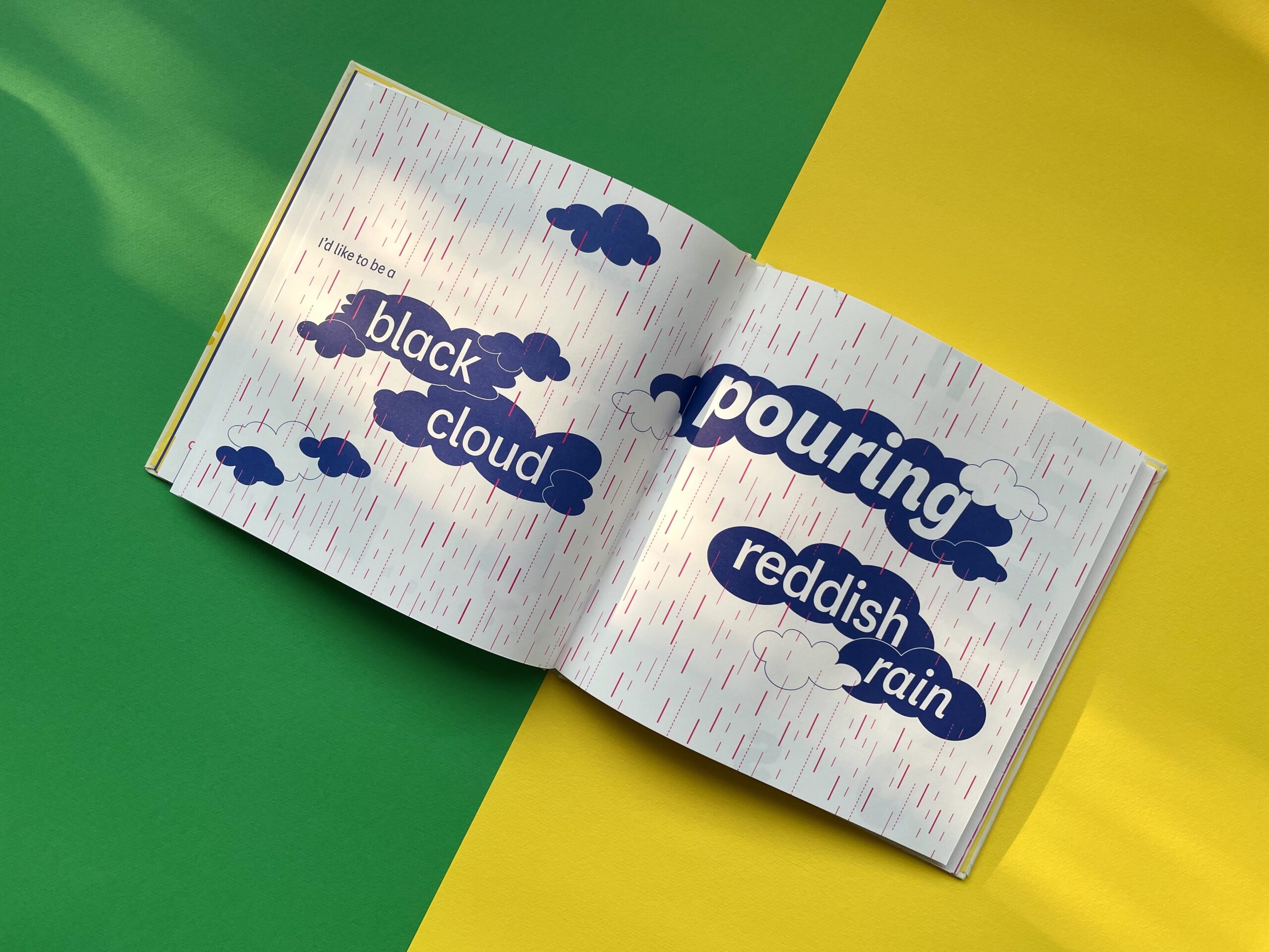
I have tried to stay true to the original approach but worked much harder on how colour can communicate. I have really thought of typography like a pencil or a paintbrush and have used type to think through making. So, it is much bolder in the creation of whole page word paintings. In many pages, I have added more detail to give context to the word—like the page with rain.
Finally, through my co-designing with children, I realised how much we limit children’s imaginations by our own views and approaches. So towards the end of the book, I made up some imaginary things in relation to the words in homage to the wild and wonderful imaginations we have when we are children.
Anything else you’d like to add?
It is an incredible privilege to work with a publisher who sees publishing as a conversation. The conventional journey of designing a book passes from writer to designer to production. The journey at Tara is much more iterative and conversational and benefits from so much back-and-forth—all of this adds to the book. Finally, I would say I am extremely lucky to work with writers such as Anushka Ravishankar who see words visually and not just write them. This makes my job utterly joyful.
Gita Wolf started Tara Books, as an independent publishing house based in India. An original and creative voice in contemporary Indian publishing, Gita Wolf is known for her interest in exploring and experimenting with the form of the book and has written and over twenty books for children and adults. Several have won major international awards and been translated into multiple languages. Click here to discover Tara books she has authored.
Designer Rathna Ramanathan has steered the design philosophy of Tara since the very beginning. In the process, she can be said to have pioneered innovative children’s book design in India. Her main interest is in typography as well as in changing the form of the book. She runs minus9, her own graphic design studio, and is currently the Head of College and Pro-Vice Chancellor of the University of the Arts, at the Central Saint Martins College in London.
Dubbed ‘India’s Dr. Seuss’, Anushka Ravishankar is one of India’s most celebrated children’s authors, and her witty and jubilant tales are internationally acclaimed and widely translated. Anushka has now written over twenty books and travelled widely performing from her stories. In 2012, she founded the Indian children’s publishing house Duckbill together with Sayoni Basu.
No Comments