


11 Sep Design Changes the Way Meaning is Made
By Gita Wolf
When you design something, you go about your task deliberately and intentionally. Design, by definition, is intention. It’s concerned with how to solve the problem of giving the best possible form to an object. Yet curiously enough, when something – say a book – is well designed, the form appears self-evident, as though it could be no other way. The design process has erased itself. So we wanted to give design its due, by drawing attention to how it creates the final manifestation – or meaning – in our books. In other words, for us, design is an editorial voice. Book design arranges all the elements which make up a book – it is not merely decorative. It deals with book forms, layout of text and image, typography, cover decisions, material for production and printing techniques. Seen broadly, our design thinking fits into our overall belief in the physical book as a sensory object.

Physical books are sensory objects
They invite reading, seeing, and touching. But what differentiates a book from a cultural object is the narrative – or context – embedded in it. In a world where so much of experience is virtual, a sense of form and material – weight, tactility, texture and feel – adds a different meaning to content.
We were first introduced to the idea of contemporary book design by Rathna Ramanathan – now Head of College at Central St. Martins, London – who came to us as an aspiring young design student and threw her lot in with us from the very beginning. While we’ve worked with a number of talented book designers since then, Rathna has steered our design philosophy to what it is today.

Rathna Ramanathan
Book Forms
The first thing Rathna inspired us to look at. The classic form of the printed book – sheets of paper bound together with a cover – has been around for 500 years, for good reason. But there are other traditions of the book – scrolls, textiles, wooden shrines – from different cultures, as well as more modern experimental forms like artists’ books. We wanted to challenge our readers’ expectations, but also enable them to experience the meanings different book forms create, with a sense of wonder.

Clockwise from top left: Persian Purim text, 4th century; Greek Dead Sea Scroll, 5th century; Palm Leaf Manuscript, South India, ca. 10th century; 17th century 45 foot long Hindu scroll; Mayan books, ca. 16th century; Bamboo book from China, ca. 10th century
Experimenting with local skills and materials
We were keen to discover what was possible in our context, available to us locally – and this led to the creation of our first book made entirely by hand, a silk screen printed on hand made paper. It won the prestigious Alcuin Citation for book design in Canada.


The Very Hungry Lion – Author: Gita Wolf, Illustration & design: Indrapramit Roy
Handmade books
We continue to make these signature books – to date, we have a total of 20 titles in print. They use local materials and artisanship to bring beautiful art to life. Scalability is important: we need to make them in numbers that keep them affordable for the buyer, while making sure our artisans are paid fairly.

Other forms of the book
Our design thinking is led by the implicit rule that the reason for choosing a particular form is not whimsical, but is a necessity led by content. A successful book combines rich content with the right aesthetic form. The scroll, for instance, allows the eye to move around, reading the page as a space, rather than a series of lines. It need not be chronological. In other cases, the eye is led by the movement the form dictates.


Lucky/Happy Hans – Illustration & design: Marcos Guardiola


The Enduring Ark – Illustration: Joydeb and Moina Chitrakar, Design: Jonathan Yamakami
Book architecture
The flow of content in a book can unfold physically to create an interactive experience.


10 – Design: Marion Bataille


Fruit Salad – Illustration & design: Chiara Armellini
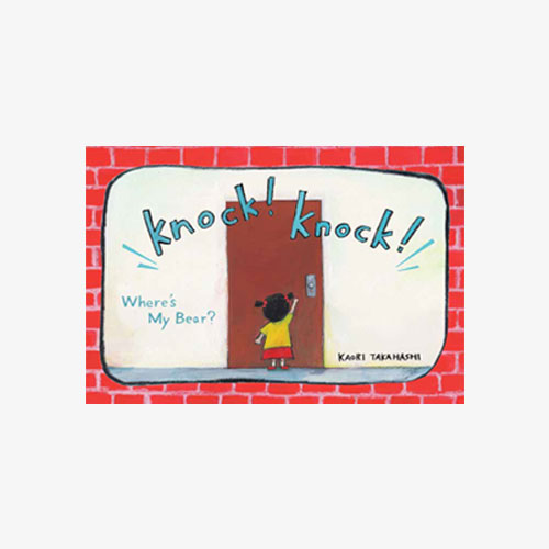
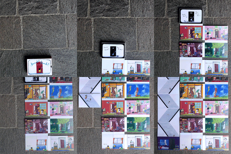
Knock! Knock!
Illustration & Design: Kaori Takahashi
Typography and type play
The art and technique of arranging type is not just for embellishment. Typography visualizes language. The key is to find a balance and guide readers without being intrusive – to nudge, rather than state. Good design brings in gaps in the narrative which the reader – child or adult – can fill in.
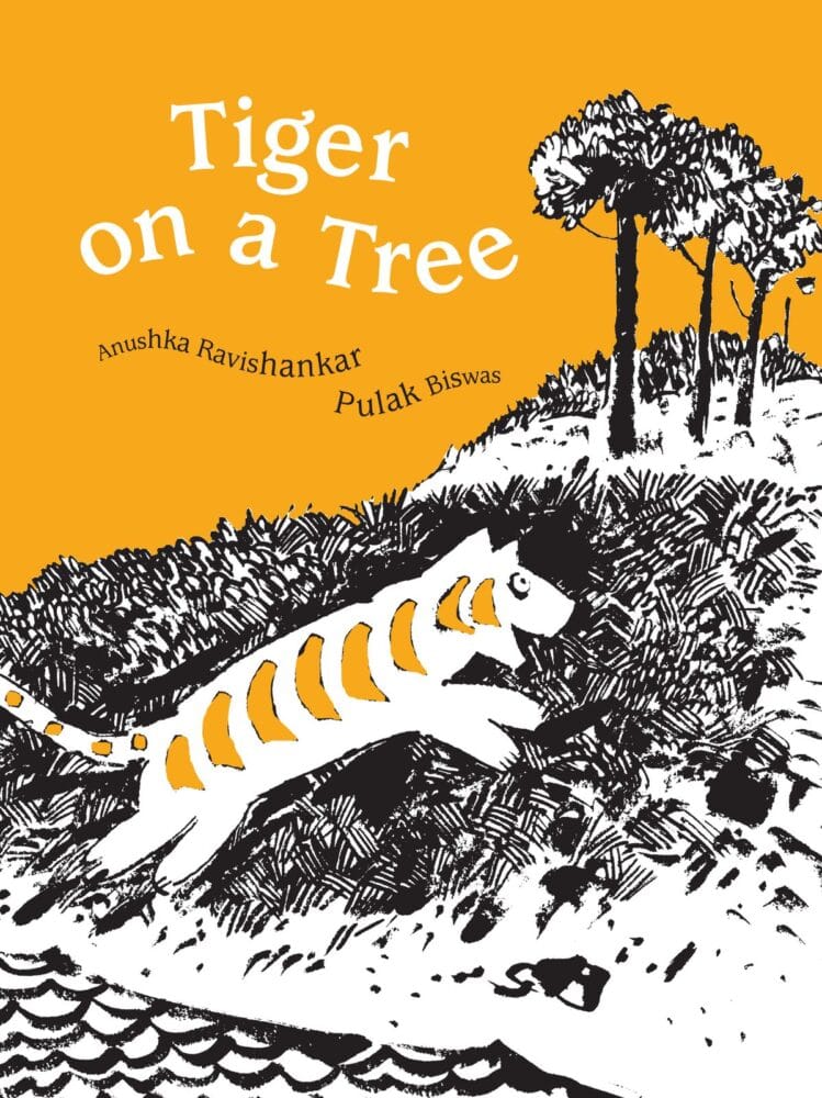


Tiger on a Tree
Author: Anushka Ravishankar / Illustration: Pulak Biswas / Design: Rathna Ramanathan
It’s exciting to play with type in other ways: to create visual objects from text or to make shapes and images in the manner of pictograms. This playful illustration of a piece of nonsense verse for children is radically experimental. It’s a visual and verbal puzzle that also mimics the sounds of reading aloud. Our only caveat, when we come up with a book like this, is that it should also communicate to the intended audience.


I Want to Be
Author: Anushka Ravishankar / Illustration & Design: Rathna Ramanathan
Here is typography used as illustration in a book for adults, which allows for playing with allusions and metaphors. It’s a typographical illustration of a poem by Christian Morgenstern, a German poet of the last century – the design is inspired by the industrial production and constructivist art of the time.


In the Land of Punctuation
Author: Christian Morgenstern / Illustration & Design: Rathna Ramanathan
This book was co-published with the Centre Pompidou in Paris for an exhibition on Surrealism – a poem by Paul Eluard, illustrated with type. The design was inspired by surrealist ephemera, part of Centre Pompidou’s archival collection.


Liberty
Author: Paul Eluard / Illustration & Design: Rathna Ramanathan
The designer as author
There is an authorial aspect to design in most of our projects, but here the design changes the way meaning is made. It is the final voice which brings in additional meaning. This is a 16th century trick poem from England: read line for line, it makes no sense. If the line is split in the middle and read with the first part of the next line, it makes sense. We asked the illustrator to create images for both readings. The designers made the layers of meaning come alive through inspired die cuts and colouring in the original black and white drawings.


I Saw a Peacock with a Fiery Tail
Author: Anonymous / Illustration: Ramsingh Urveti / Designers: Jonathan Yamakami & Disha Naik
Designing books with traditional art
We work with a range of traditional artists from a variety of communities across India. Their work has moved from walls and floors to paper, but before we began working with them decades ago, they had never created a book. These books are not documents about the art form – they feature the artist as the author. Bringing such art to the contemporary reader involves design which reframes it into another context and medium. This book, in the Warli art tradition, tells the story of the artists’ journey to Japan.


The Deep
Illustration: Tushar & Mayur Vayeda / Design: Dhwani Shah
Design and production
Taking a traditional form into a different medium was particularly complex in the case of this textile book. It is inspired by a ritual block printed cloth shrine from Gujarat called Mata-ni-Pachedi, or the Cloth of the Mother Goddess. We reimagined this textile in the form of a book, constructed like an altar. It involved sewing the panels, block printing the images, adding a story board, and coming up with a cloth wrapper with screen printed text.
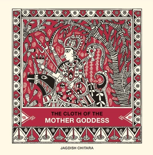


The Cloth of the Mother Goddess
Illustration: Jagdish Chitara / Design: Catriona Maciver
Forms of printing
Apart from screen printing, we’ve also resurrected a letter press machine and work on a risograph. All these production methods call for art and design that takes into account what the production technique excels at and what it cannot do. For a contemporary designer, understanding production can be challenging – how does something designed on a computer translate into something printed?


Little Girls are Wiser than Men
Story by Leo Tolstoy / Illustration: Hassan Zahreddin / Design: Sanjana Vamadevan
Stationery
To recycle the test prints which are usually discarded during screen printing, we designed one of a kind notebooks which are completely accidental and random – by design. We call them flukebooks: each notebook is unique, depending on how the cover sheet was overprinted.
Fluke sheets make strange and wonderful cards as well.


Finally, as we say time and again, publishing is a collective enterprise. We work together as editors, designers and bookmakers to bring text, art and design into the form of the book. All of us remain committed to pushing the boundaries of the physical book in an age writing its obituary.
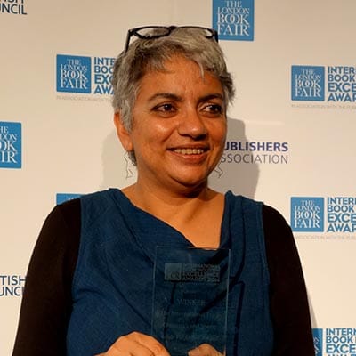
Gita Wolf started Tara Books, as an independent publishing house based in India. An original and creative voice in contemporary Indian publishing, Gita Wolf is known for her interest in exploring and experimenting with the form of the book and has written and over twenty books for children and adults. Several have won major international awards and been translated into multiple languages. Click here to discover Tara books she has authored.
No Comments