

09 Aug Warp and Weft in Book Design
THE MAKING OF 'WEAVING WITH COMPASSION'
by Ragini Siruguri
In my 8-year-long association with Tara Books, my role as a book designer has taken different forms. The projects I worked on with the team have included experiments with the form of the book and printing processes, working with various art and illustration styles, and finding typographic solutions to complex texts. But what has been the most valuable learning is understanding where design – and the designer – stands in relation to the many factors that influence the design process, from editorial decisions to production and financial constraints. It is these challenges that have often become the most enjoyable part of book design.

Books from the Makers series
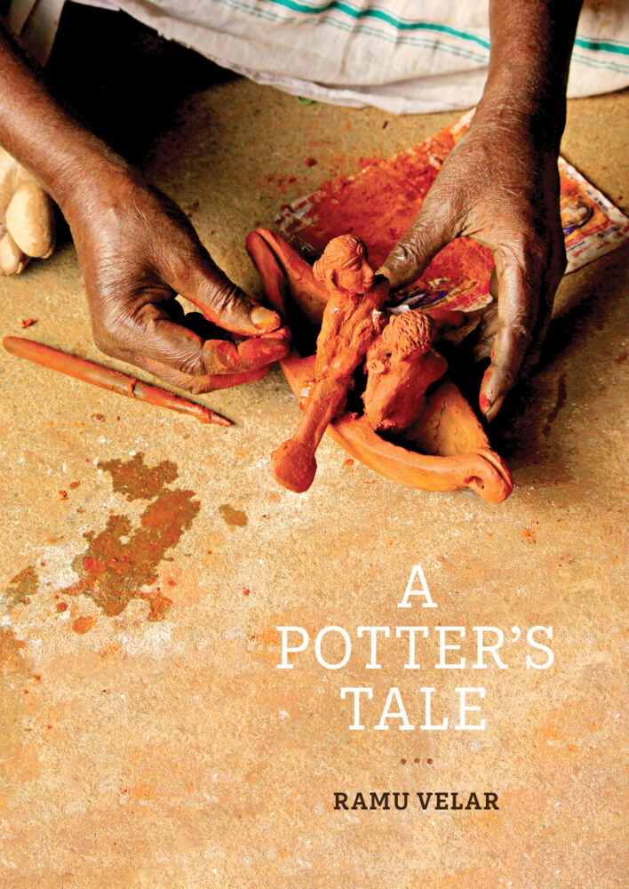
In 2021, Tara Books launched a new series called Makers, which explores some of India’s long-standing traditions of handcrafting. The first book was titled A Potter’s Tale, a complex project that was a long time in the making. As part of the design team, I helped conceptualise a broad design system for this book, which could then be adapted to other books in the series. My contribution was also as a photographer, and I moved back and forth between the two roles throughout the process. So, when I was offered the chance to work in a similar capacity on another Makers book, I realised from the earlier experience that it would help to discuss some editorial aspects of the text ahead of the design or image-making.
Visualising the book
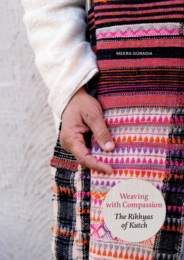
Weaving with Compassion: the Rikhyas of Kutch is a book about the Meghwal community of weavers in Kutch, Gujarat, put together by crafts practitioner Meera Goradia. Her poignant narrative focuses not only on the craft of weaving, but the weavers as well, and explores the philosophy and spiritual wisdom that have shaped the community’s craft practices.
The structure of the text was complex and included multiple narratives, with the author’s voice interspersed with those of the weavers. While the author’s text was informative and told a story of weaving over the years, the weavers’ voices brought in a deeply personal element to the narrative. Overall, the text was abstract rather than descriptive. This meant that it could not be illustrated in the traditional sense, that is, matching images to words in a simple, straightforward manner. The visual narrative, therefore, had to be metaphorical and not literal.
We decided I would accompany Meera to Kutch to put the visual narrative together. As with A Potter’s Tale, I was going to play a bifurcated role – photographer and designer.
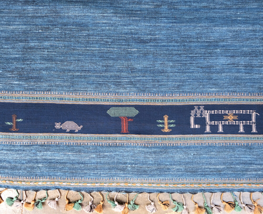
Spreads from “Weaving with Compassion’
Layout and typography
Before setting off on the photoshoot, I thought it was important that a ‘storyboard’ be developed in agreement with the author and editors. In any case, the collaborative nature of working at Tara Books ensures that the development of a book is rarely linear; there is always a back-and-forth between departments, in this case, editorial and design. This allowed us to sequence the main narrative into
various sections, leaving spaces for image features and providing a solid framework on which to build
the layout system.
In each section of this book, multiple story threads criss-crossed each other: the author’s overarching narrative alternated with short anecdotes and quotes from the weavers. The photographs would have to be woven through this framework. It seemed to me that text and image in this book – and possibly in all books – did work like the warp and weft of weaving. Both elements play a key role in creating the narrative fabric. In addition, design and typographic principles such as size, contrast, colour, texture and space help to create a balance between the two elements, which makes for an enjoyable reading experience.
After the sections were in place, other things followed. Each section needed its own page style, with a particular visual language and typographic treatment that had to function independently and in a tandem.
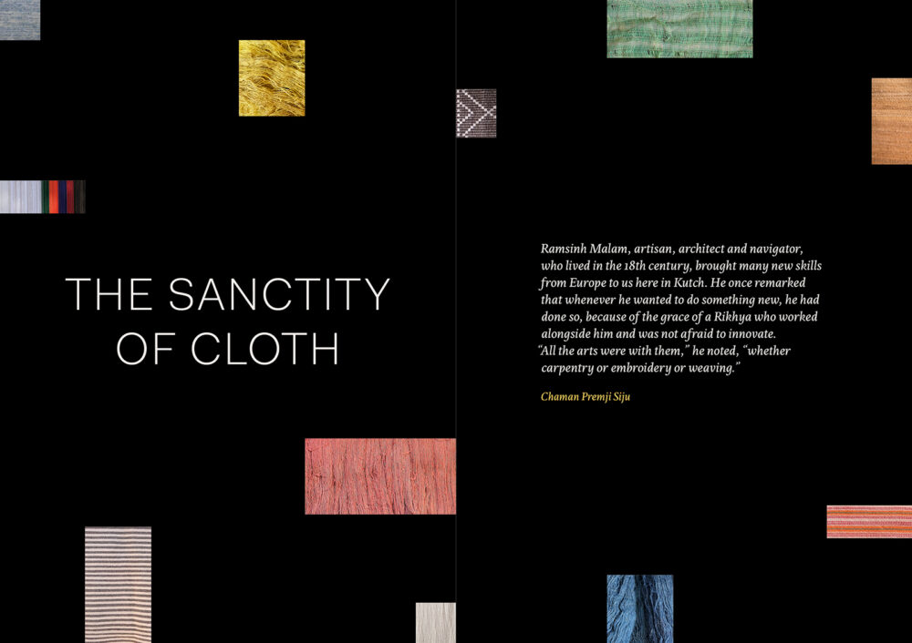
Section pages were given a full spread, with the title and epigraph placed within a collage of fabric swatches against a black tint.
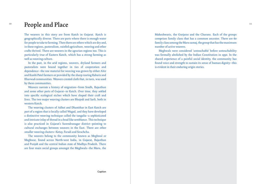
The introduction to each Section featured the overarching narrative of the author. The author’s voice was established using text in blue.
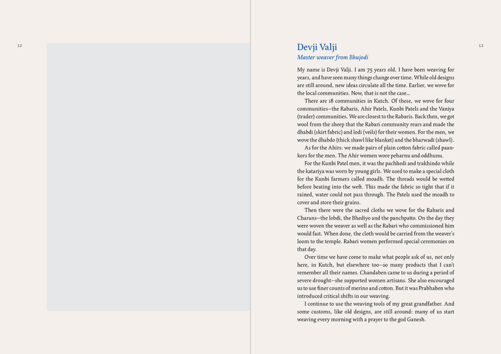
Pages featuring the weavers’ reflections were given an off-white background tint, while the text was typeset in black.
Quotes from the weavers, interspersed through the book, were treated like posters, with large typography and changing background colours.
The typography through the book made use of two typefaces: the ever-graceful Edita by TypeTogether with Thomas Thiemich’s Fakt Pro acting as a quiet and complementing sans serif.
Grey boxes were used as placeholders for images, which gave us an idea of the types of photographs that would suit the page composition, taking into consideration size and orientation on the page. Following this, we charted various themes for the photographs that had to be taken on location: photographs of place, people, and work process. We wanted to collect a wide enough variety of images under each theme, so that they could be threaded into their own visual narratives at the design stage. For me, the challenge was to come up with a flexible layout that would accommodate these various visuals, without knowing what the final images would look like.
With these core aspects of the design in place, I was ready to make the trip to Kutch. There was no guarantee of how this trip would play out, or whether I would be able to get all we needed, but time, cost, and logistics determined that we had to make the most of this one visit. Planning, flexibility, and a bit of luck were essential.
Collecting the photographs
In early 2023, I travelled with Meera on a two-week visit to Kutch at the peak of the winter season. I was kindly hosted by Khamir, the well-known crafts organisation near Bhuj, at the centre of the large Kutch district. With this beautiful campus as a base, our itinerary included visits to weavers’ homes in at least ten villages in the region, from Ghanitar in the east to Lakhpat in the west.
The peaceful surroundings of Khamir Crafts Resource Centre in Kukma, near Bhuj
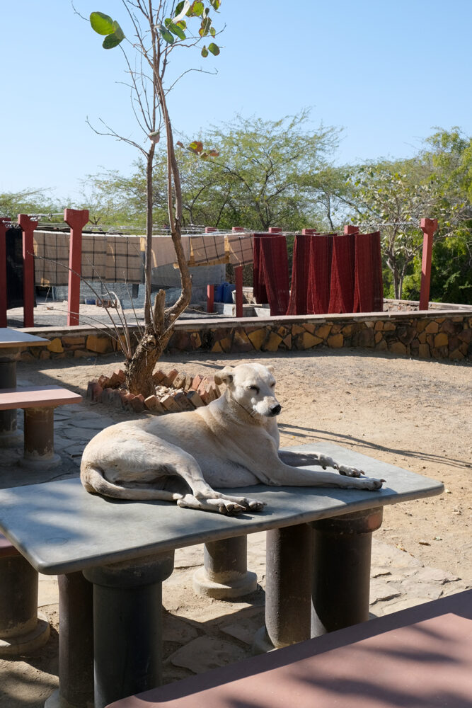
It was an ambitious plan, but it was made possible thanks to Meera’s extensive work in the region and her close relationship with the weaver community. In hindsight, it was also the deep trust and mutual admiration between Meera and the weavers which allowed them to welcome a stranger with a camera into their homes.
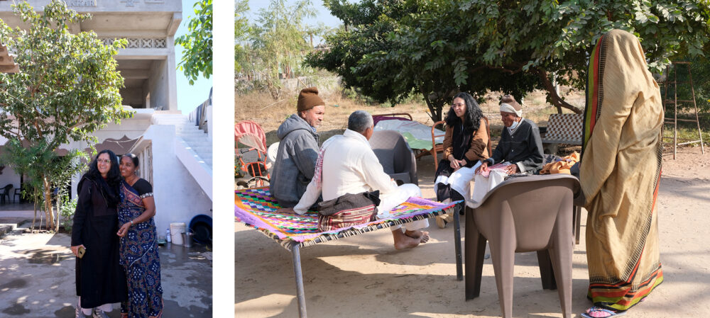
Meera Goradia with Premjibhai Velji Siju and family and Rajiben Murji Loncha
I am not a professional photographer, but I use photography as an aid in my research and design process. In this case, my approach was through the lens of a book designer. The intention was not to conduct a formal photoshoot; there were to be no posed portraits or staged scenes, and my equipment was limited to a compact digital camera. Instead, this was to be a visual interpretation of the community’s spirit and compassion that the author had captured through words.
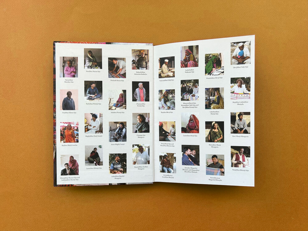
Following the themes we had in place, I made sure to collect photographs of various kinds. Portraits were given priority as they were a significant element in the layout. The best moments were when the weavers, in conversation with Meera, would recall an endearing memory or spoke passionately about their craft.
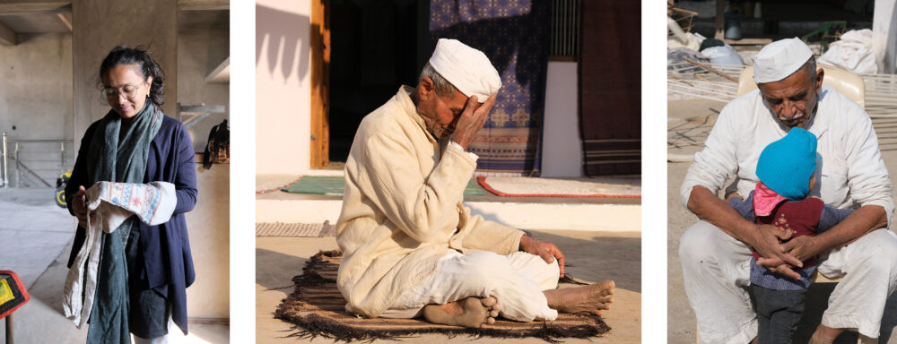
Champa Siju Mangaria spoke affectionately about her father, who wove the bag she was holding for her; Vishrambhai Valji Siju in a moment of reflection; Devjibhai Valji Siju with his grandchild
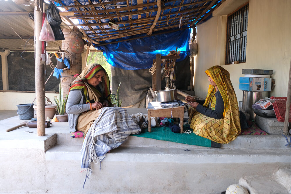
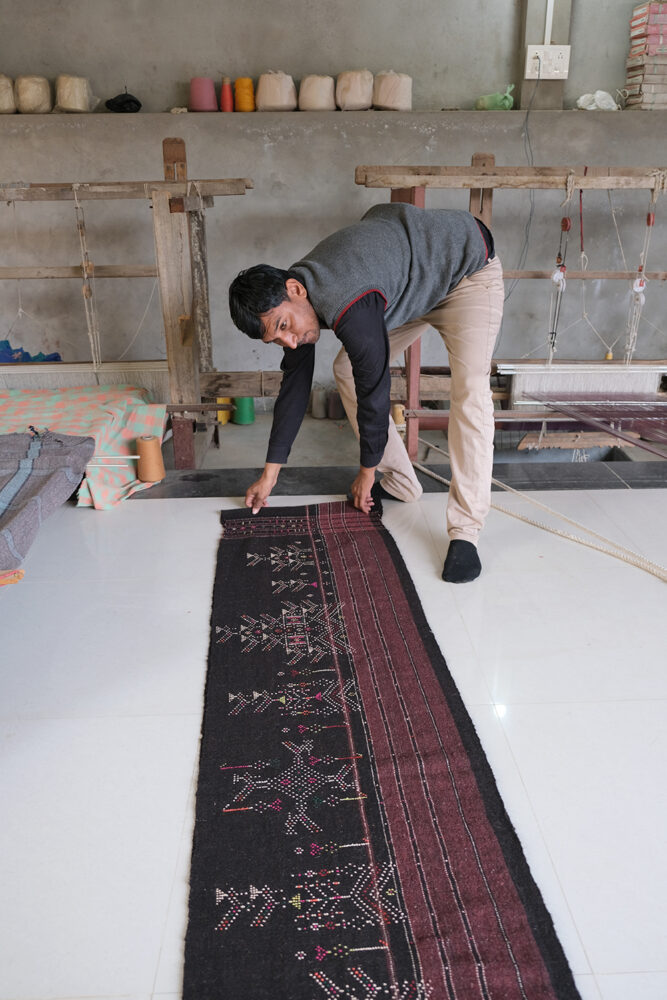
I also made sure I had photographs of tools, materials, and workspaces as these would be useful in recreating a sense of the physical space in which the craft was practised. Likewise, I ensured that I had photos of the various stages of the weaving process.
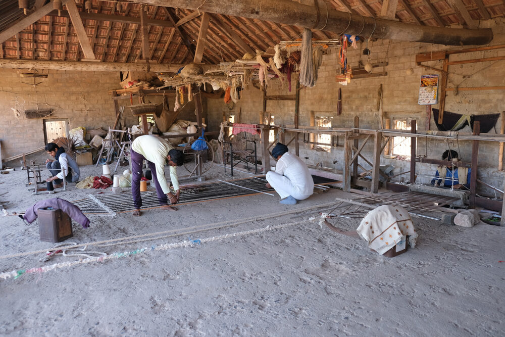
Meghjibhai Hari Sanjot’s weaving workshop;
Bayaben Devji Siju and Lakshmiben Damji Siju making tassles at their home
Given the expanse of the Kutch region, images of the semi-arid landscape through our travels, I thought, would give a sense of the vast geography that the craft was spread over.
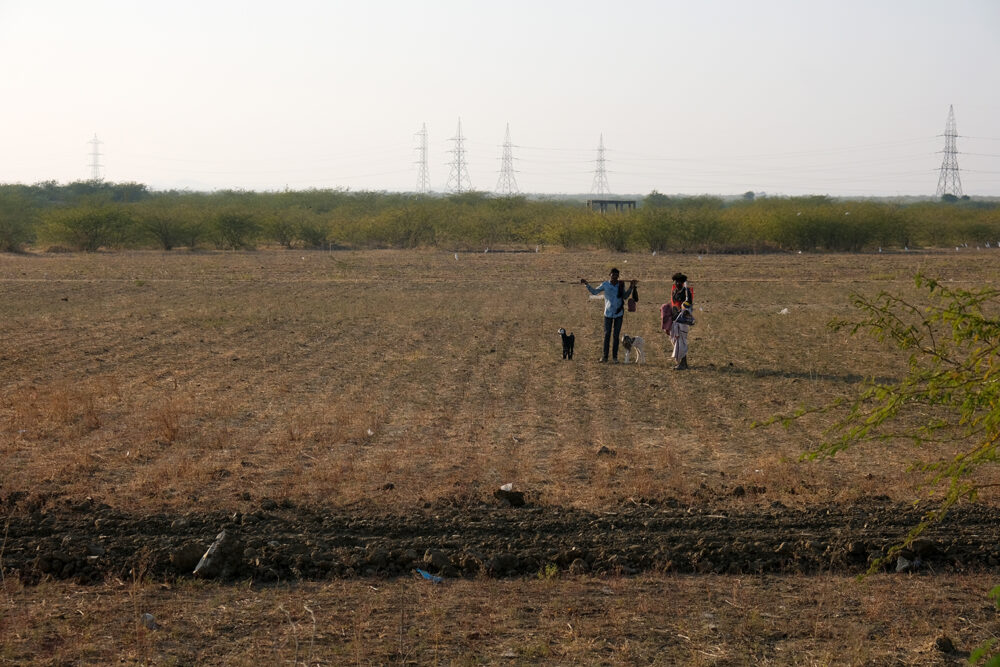
Goatherds in the fields while the flock grazes nearby
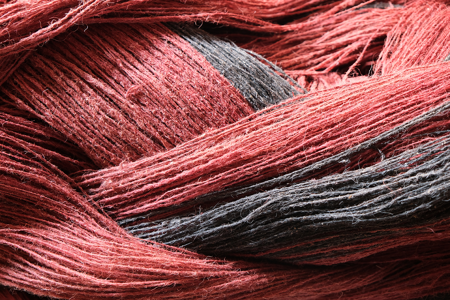
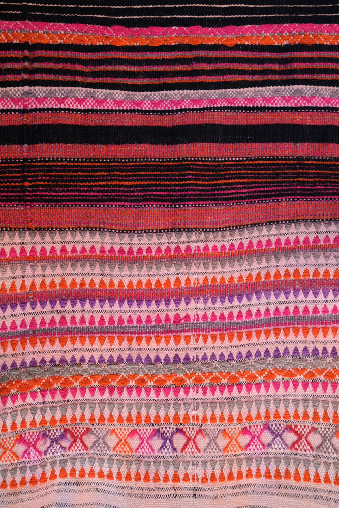
In addition, I collected close-ups of yarn and textiles, with their stunning colours, patterns, and textures.
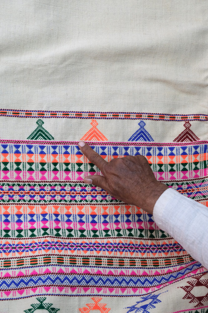
Arun Meghji Sanjot and Sureshkumar Maganlal Dhaiyda display textiles to be photographed;
a weaver explains motifs that are characteristic of weaving in the region
There were a host of miscellaneous photographs as well — decorated doors, grazing sheep, a room for storing yarn, and more — that formed an essential part of the visual landscape of the region. We had a range of photographs, and many of these would prove useful later, when the layout came together.
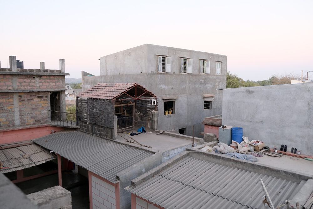
A loom set up in a makeshift shed
on the roof of a house
Paintings on the walls of a weaver’s house
Guests at a community wedding where almost 30 couples were married in a common ceremony
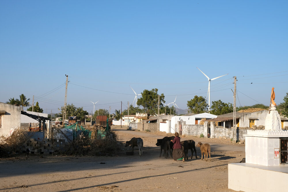
Wind turbines from fast-paced developmental projects in the area are an unmissable
part of the landscape
The complex organisation and planning for this visit and travel over long distances every day meant that the photo-taking had to be done as quickly and unobtrusively as possible. On most days, we were also frantically chasing the light, hurrying to reach our destination before the ‘good’ light and shadows vanished. In retrospect, the photographs became a by-product of the greetings, invitations to come in, curious enquiries about this book, and discussions on the craft and community over several cups of hot chai. I was a fly on the wall, and with my knowledge of Gujarati beginning and ending with kem chho? (how are you?), my communication with most people was through warm smiles and gestures.
Bringing the book together
Back at my desk at Tara Books, the next task was to sort through the many folders of photographs and make a shortlist. In the process, we found that there were several photographs that could be strung together as stories in themselves. However, such images were tangential to the main narrative and would hinder the flow of reading if placed within it.
At this point, we made the decision to introduce some image-only sections, which would serve as a bridge between two text sections. This was also a chance to feature people and processes that did not appear elsewhere in the text. Eventually each of these visual narratives featured photographs that would help readers recreate the many worlds of the weavers in their own imagination.
The first image-only section, titled ‘Plant to Loom’, traces the journey of cotton from the cotton fields to the handloom. It briefly shows the various processes it undergoes, such as processing, spinning, and dyeing, until it is set up on the loom to be woven into cloth.
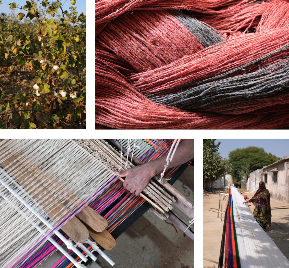
The indigenous kala cotton plant; dyed yarn; sizing the warp; weaving on a loom
The second, called ‘Weaving Stories’, focuses on the craft of the weavers and includes a selection of weaves, from traditional designs to newer experiments. During our trip, we had requested each weaver to show us and talk about a piece of woven cloth that was personally valuable and meaningful. This memory that they associated with the fabric brought out the deep interconnection between their lives and their passion for the craft. This section is also a subtle reference to an earlier book by Tara Books called Signature, which featured a collection of decorative patterns, each unique to the artist, by an indigenous artist community from central India.
Pachchan Premji Siju’s textiles combine weaving with narrative storytelling; Champa Siju Mangaria
was inspired by the waste strewn in her village and wove this piece using bits of plastic
The third section is titled ‘The Flame of Being’ and features photographs of a tradition practised by the community called ‘paatkori’. The ceremony, which was specially organised by the community during our visit, had begun late at night and went into the early hours of the morning. The combination of rituals and music had created a charged atmosphere and taking photographs at this sacred gathering felt highly intrusive. Moreover, it seemed impossible that the true spirit of this tradition could be captured in any way. Looking back, it was an incredible experience but also the most challenging part of the photography for this book.
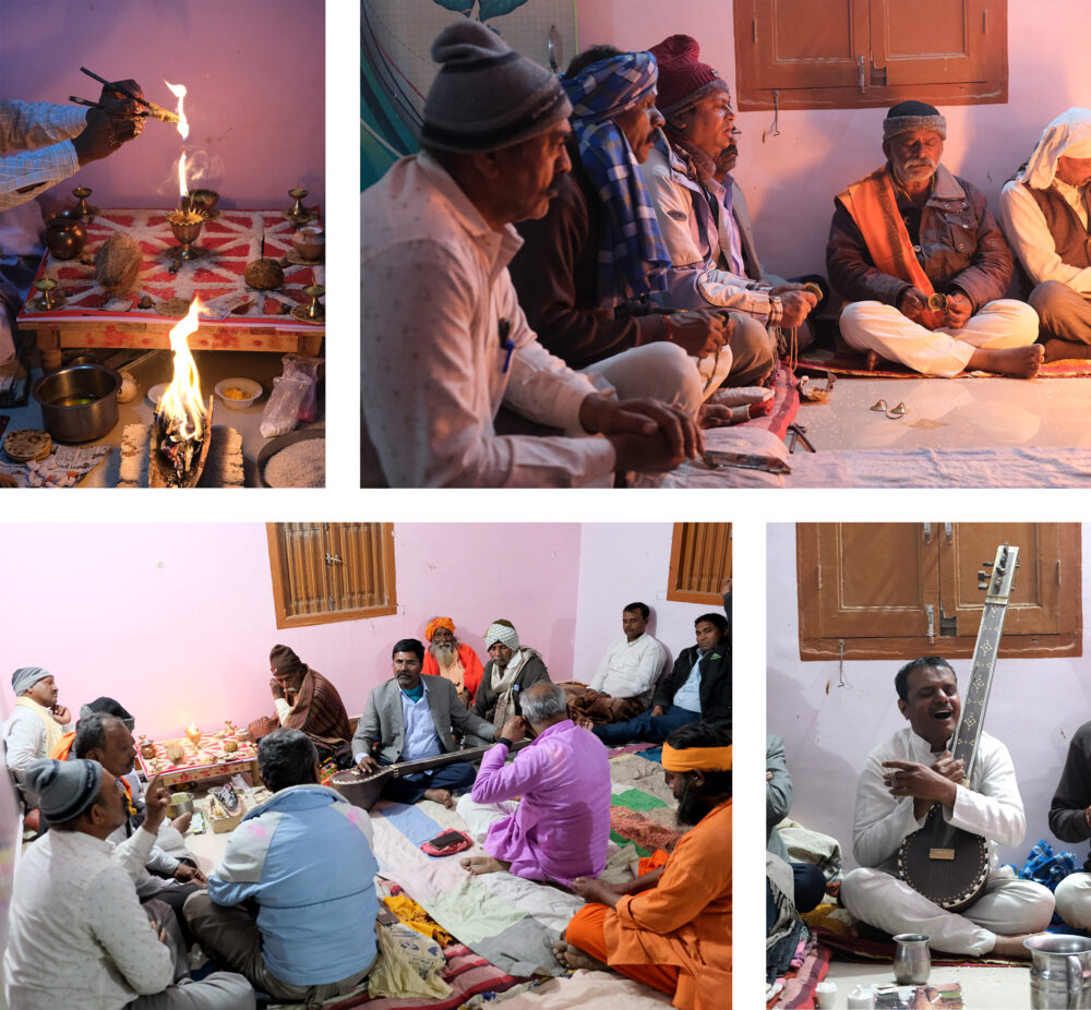
A paatkori in progress
In contrast to the complexity of the book’s interior, the cover design for Weaving with Compassion fell into place quite naturally, to our surprise. It is in keeping with the theme of making by hand, which is the hallmark of the Makers series.
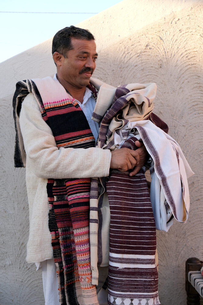
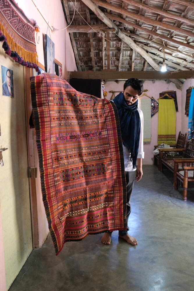
Shamjibhai Vishram Siju displays traditional shawls from his collection
This shawl, chosen for the cover is among early influential designs that were woven in the 1960s
The End and the Beginning
The photography and design approaches for this book went beyond technical complexity. They also involved figuring out the best way to visually convey the subtleties of a profound culture and the collective wisdom of its people. With the creative flexibility Tara Books granted me and Meera’s guidance throughout our travels, my experience of putting together Weaving with Compassion evolved into something much more than a book design project.
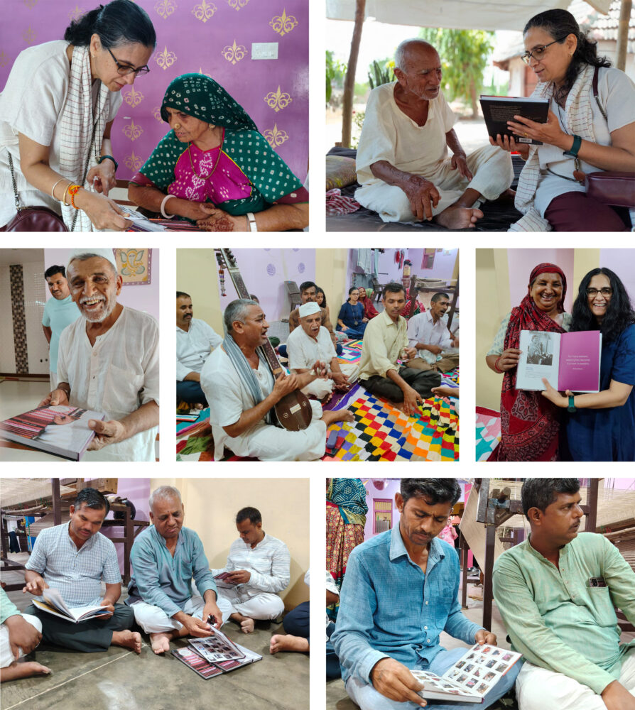
Soon after completing this project, I paused my practice as a book designer to begin a postgraduate course in design research in the United Kingdom. This meant that I would miss the most exciting part of book production and publishing – seeing it all come alive in print. I was envious of the Tara Books team as they shared with me photographs of the printing-in-progress. However, this disappointment was quickly replaced by gratification when the book made its way from the shelves at Tara Books, via Meera, to the weavers in Kutch. Here, it was celebrated with music and the coming together of the community. There could not have been a more fitting start to the book’s journey.
Ragini Siruguri is a visual communication designer from South India whose practice lies at the intersection of book design, typography, research and writing. Her approach to work is guided by a belief that any form of design is inseparable from the cultural, historical and political context it is created within. Ragini is currently finishing an MA in typography research at the University of Reading, United Kingdom.
No Comments