

23 Feb 10: Time and Movement in Book Design
Gita Wolf interviews Marion Bataille
There is nothing we enjoy more than playing with the form of the book, and meeting the French artist Marion Bataille was a revelation. Marion performs an incredible feat – she pushes the borders of bookmaking beyond text and illustration. Her pop-up books – originally published in France by Albin Michel – are three dimensional interactive wonders. They play with design, architecture, time and movement – sophisticated concepts, but realised with such deceptive simplicity that the experience is accessible to the youngest of readers. The books have been wildly successful, a fact that sits lightly on Marion, who is characteristically modest about her achievements.
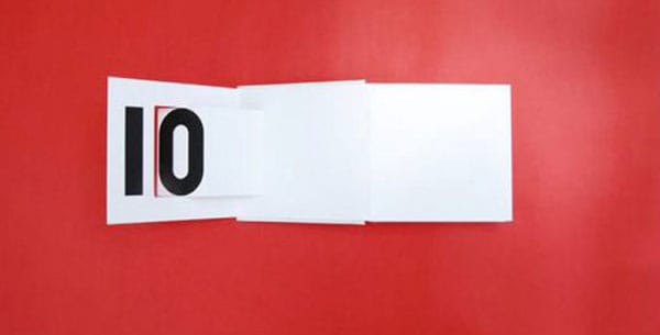
We published her pop-up alphabet book ABC3D in India in 2009 (it is currently out of print), under our visual arts series French Focus, in association with the French Embassy in India. Her second book with Tara is 10, her astonishing experiment with the shape of numbers, and the pleasure of basic counting. The pages unfold like theatre props, taking their time to fall into place… from 1 to 10, and then back again.
How is ABC3D different from 10?
In both books I wanted to see how the structure of the book and the structure of typography could meet. In ABC3D each letter is unique, and the regular succession of pages creates a rhythm that is contradicted by the dialogue between letters. In 10 all the figures are part of one single system. I imagine a relationship between the shape of figures and finger counting. The form of the book plays its role too.
Can you talk a little about your journey as an artist, illustrator and designer? Did you need special training for your experiments?
I graduated in graphic design and still make a living out of it. But on the side, I wanted to be a photographer, I was creating stage design and costumes for friends, I tried to be a dancer, a dressmaker, I worked as an illustrator. Some of these practices I have stopped, and some I carry on. I am an amateur. Since ’86, I also experiment with the pop-up technique. I trained myself by observing and with pop-up manuals, and in 2004, the project of a pop-up alphabet book took shape.
Apart from the Latin alphabet and Arabic numerals, you seem to be exploring ‘building blocks’ of a certain universality. What are these?
I hone, I simplify, I remove, that’s how I worked in both books. Working towards structure in graphic design is just another way of seeing, it it is no more close to universal than being ornamental. If I show a dot and a line, it is like sharing my graphic tools, my building blocks, then I would propose a way to use these tools, a manual.
What is your relationship to mathematics and logic?
I had no interest in Math until I took philosophy classes at school, but then it was too late to catch up. I am still at that stage. I passively find Maths and logic beautiful.
10 is more abstract than ABC3D – would you agree?
Yes, ABC3D talks more to senses.
How long did you work on 10? Did you collaborate with a paper engineer to make this work commercially?
I worked two years on 10. I do all the paper engineering myself, it is part of the conception.
Could you talk about what time and movement mean to you in book design?
Time is what holds the pages together in a book, usually it is a story from the beginning to the end. Alphabet and succession of figures are a list, a list does not hold the pages together. The movement brings the dimension of time and at the same time shows that an open book is a space.
Neither ABC3D nor 10 could have come from any country except France – we continue to be impressed with the adventurous visual publishing from there. There also appears to be less of a forced split between books for children and for adults. How are children’s books different?
No, there is always an adult between a book and a child: a publisher, a librarian, a relative. So there is no book for children. It is something to share. I hope an adult would find something for himself in the book that he’d eventually want to share with children.
In design, what is the relationship between simplicity and complexity? In your books complex conception is hidden behind the simple and communicative meaning which emerges.
In graphic design you are submitted to taste, appearance, it is its lightness. Meanwhile you must know the technique, but should not show your skills, otherwise you are a technician. There is also a tradition of functionality in graphic design, which serves the cause of legibility, clarity of purpose, communicating information. I found my personal interest in this tradition, the technique is my own.
What are you working on now?
On building blocks. On prototypes, but I haven’t found a publisher yet. And on a new book.
Artist Marion Bataille was born in 1963, and lives and works in France. She is a widely published graphic artist and illustrator who also works for the Pompidou Centre, Le Monde, and some of the best French Publishers. Click here to discover Tara Books she has authored.
No Comments