

23 Sep Letterpress Prints:The Making Of Little Girls Are Wiser Than Men
by V. Geetha and Sanjana Vamadevan
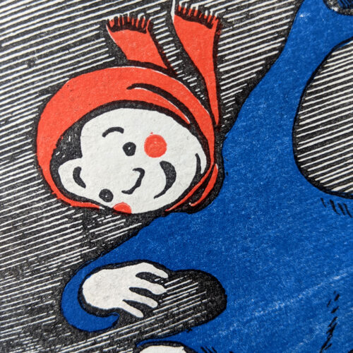
Our linocut-illustrated, letterpressed classic Little Girls Are Wiser Than Men was released in February of 2021. Adapted from a poetic short story by the great Russian writer Leo Tolstoy, this astute tale about conflict and resolution has been illustrated by the Lebanese artist and lithographer Hassan Zahreddine.
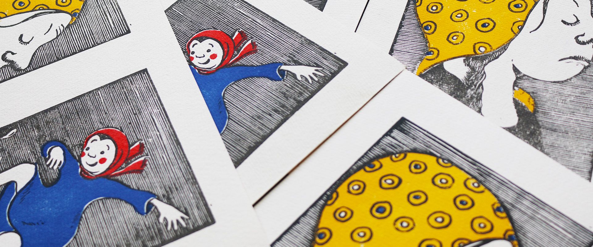
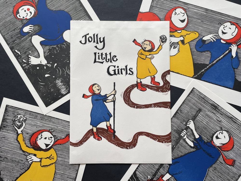
We had worked on this book through the first phase of the pandemic from mid-March to October 2020, and it was published just before we were hit by the second wave in March 2021. Now that we’re slowly emerging into what appear to be happier times, it seems apt to offer our readers a set of joyous letterpressed prints from the book, which we’ve named Jolly Little Girls.
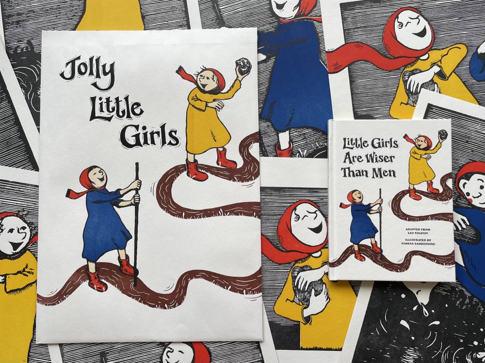
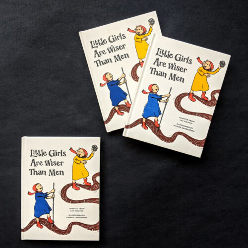
Jolly Little Girls letterpress prints and pack featuring illustrations from Little Girls Are Wiser Than Men.
This also seems a good occasion to talk about how the book was made. Hassan Zahreddine came to us for a residency in August 2019, supported by the UAEBBY and from the very start, our conversations proved to be extraordinarily enriching. Hassan is a wonderful printmaker, and we were keen to find a project that would highlight his linocut illustration skills. Little Girls Are Wiser Than Men, set in the 19th century when printmaking was widely used as book illustration, seemed a great fit.
Hassan Zahreddine at work
Meanwhile, on our part, we had always been keen on exploring and reviving different printing traditions – and what would mirror all the possibilities and constraints of classic printmaking better than a letterpress? Here was a book whose meaning really stood to be enhanced by the printing process. Leo Tolstoy’s wisdom tale was from a period in history which saw the expansion of print across the world. Added to which Hassan’s linocuts hark back to a time of printing with wooden blocks. Although current letterpress technology has moved on from carved wooden blocks to etched metal plates mounted on wood, it still manages to capture the indefinable charm of the physical impression of lines on paper, with all its minor imperfections. The colours mimic the effects created by lino printing, lying vividly on the page, instead of merging with the paper. And most importantly, letterpress printing, in its own way, echoes and amplifies the artisanal labour that goes into printmaking.
We had bought a vintage 1965 Heidelberg press some time ago but had never managed to meet the challenge of producing an entire book with it – so this seemed a perfect opportunity to try our hand at doing just that. Our production manager C. Arumugam had worked with letterpress technology 30 years ago, when it was still in everyday use, and he remembered something of the process. But he also knew that to ‘revive’ letterpress printing wouldn’t be easy. Machinists familiar with the process were not around anymore. Neither were block-makers, who created the text and image blocks used for printing. But in his inimitable way, Arumugam somehow managed to locate a machinist who would repair and recondition our press. He also found a block-maker familiar with the old ways, but willing to experiment with what we had in mind. We were all set to go.
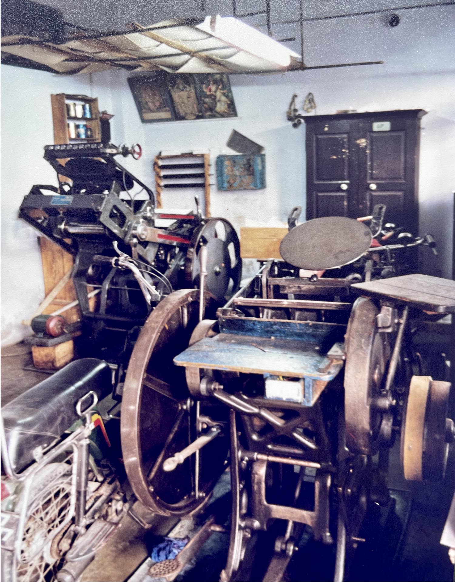
Letterpress machines at a printing unit in Sivakasi, India
The first step, ironically, called for the conversion of physical prints into digital images for designing the layout. Hassan had originally etched his art on linoleum. Now he needed to ink these etchings, make proof prints, and convert them into digital images.
Our designer Sanjana Vamadevan then went on to design the book. In her layout, she was inspired by the design of classic 19th century wisdom tales: story and illustrations on facing pages, the text set in Monarcha typeface, with ornaments, spacing and leading reminiscent of the period. In keeping with this, we decided to caption the images – 19th century style – which added a bit of wit and whimsy. We decided to print the book in four colours – yellow, blue, red and black. They appear interchangeably, depending on how the pages unfold, with black as a constant – in effect, each image is rendered in two colours, with an added layer of black. The cover is printed in six colours, with an additional beige and brown.
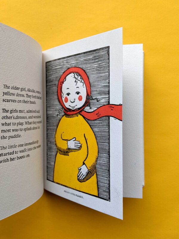
A spread from Little Girls Are Wiser Than Men
The next step was to convert the digitally-designed pages into files used to make letterpress printing blocks. It was a slightly surreal experience, as if we were moving back and forth, not only between geographies – Russia, Lebanon, India – but also technologies. From linocuts to inked proofs to digital images… and then from digitally-designed files to film to etched metal printing plates mounted on wooden blocks… all of this leading finally to the physical letterpress. In effect, we were not simply ‘recreating’ or ‘recalling’ older ways of printing so much as creating a new and interestingly integrated production process. It was fascinating enough for us to keep a log of the various steps involved, and to share them with our readers.
The first step was to prepare the digital files and transfer them to film, to make printing plates and blocks. In letterpress technology, unlike in offset printing, all the colours can’t be printed together. Each colour needs its own printing plate. So every page needs to be colour separated, and files made for each colour. These files are then transferred to film and then onto printing blocks.
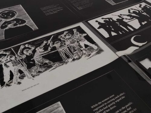
Colour-separated negatives
We sent the films for block making to a unit called Daya Process. They’d been in the business for three decades – the founder had a lot of experience in block and plate-making. We discovered that he’d even published a book in Tamil on the art of making blocks, intending it to be a manual for workers.
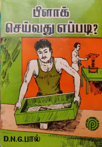
The block-making manual
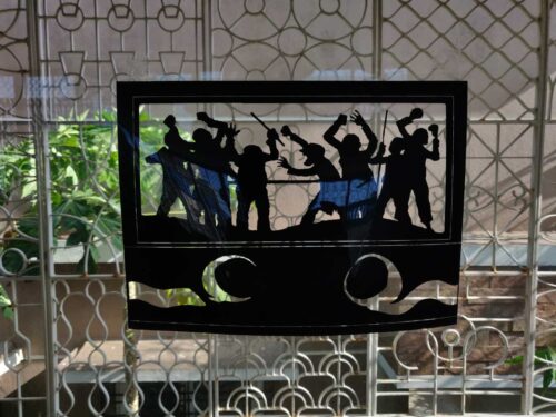
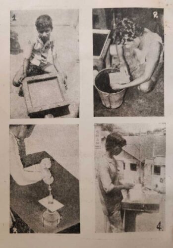
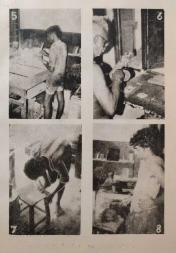
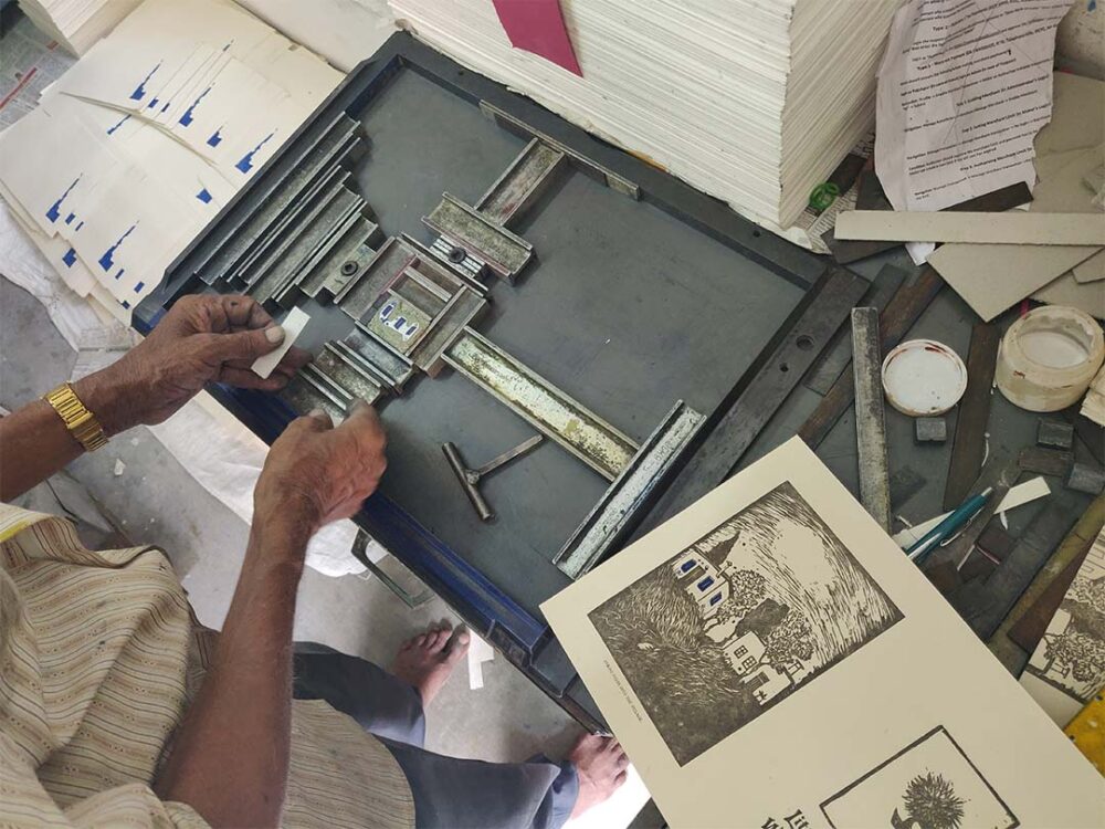
After they received our films, the artisans at Daya followed a smooth sequence of tasks. We’d hoped to photograph them at work, but lockdown restrictions were tough during that time, and we couldn’t visit them as we’d hoped. When we finally went by again, they’d finished our commission, but generously agreed to us photographing them at work on other blocks. So the images here show block-making in a generic sense, rather than our particular project, but they still provide a rare glimpse into the many steps involved in this artisanal process.
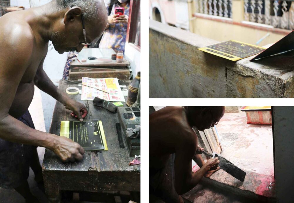
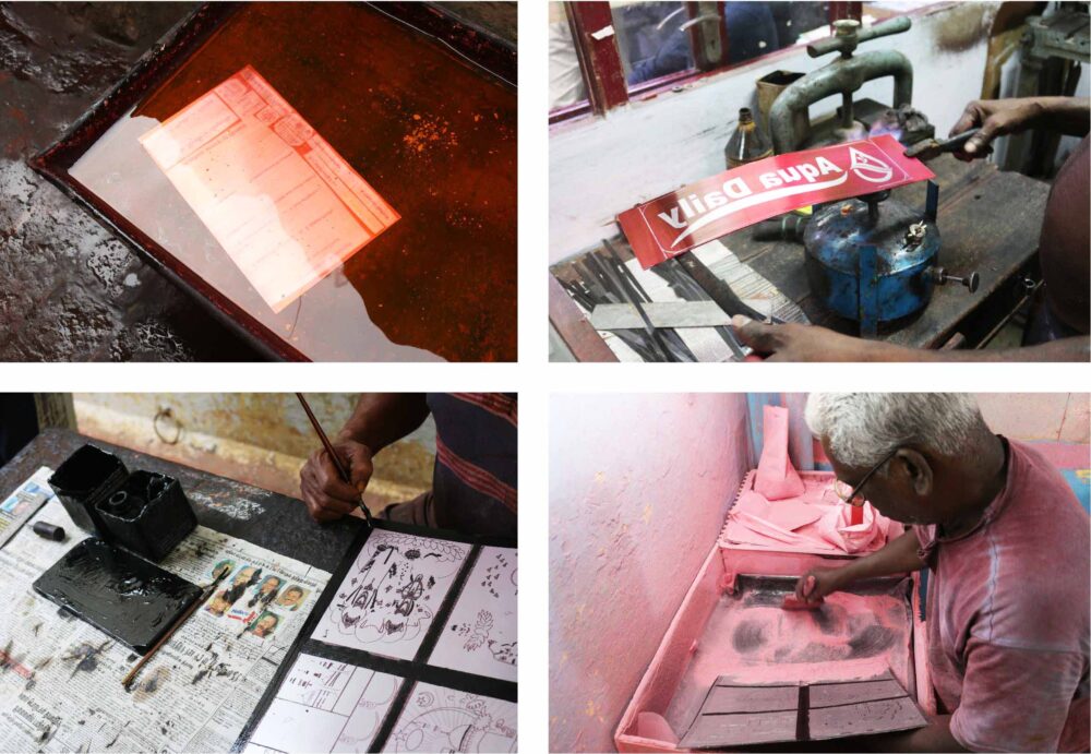
Block-making at Daya Process in Chennai
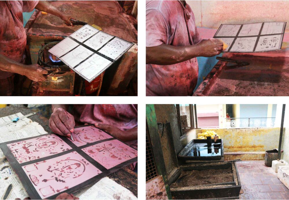
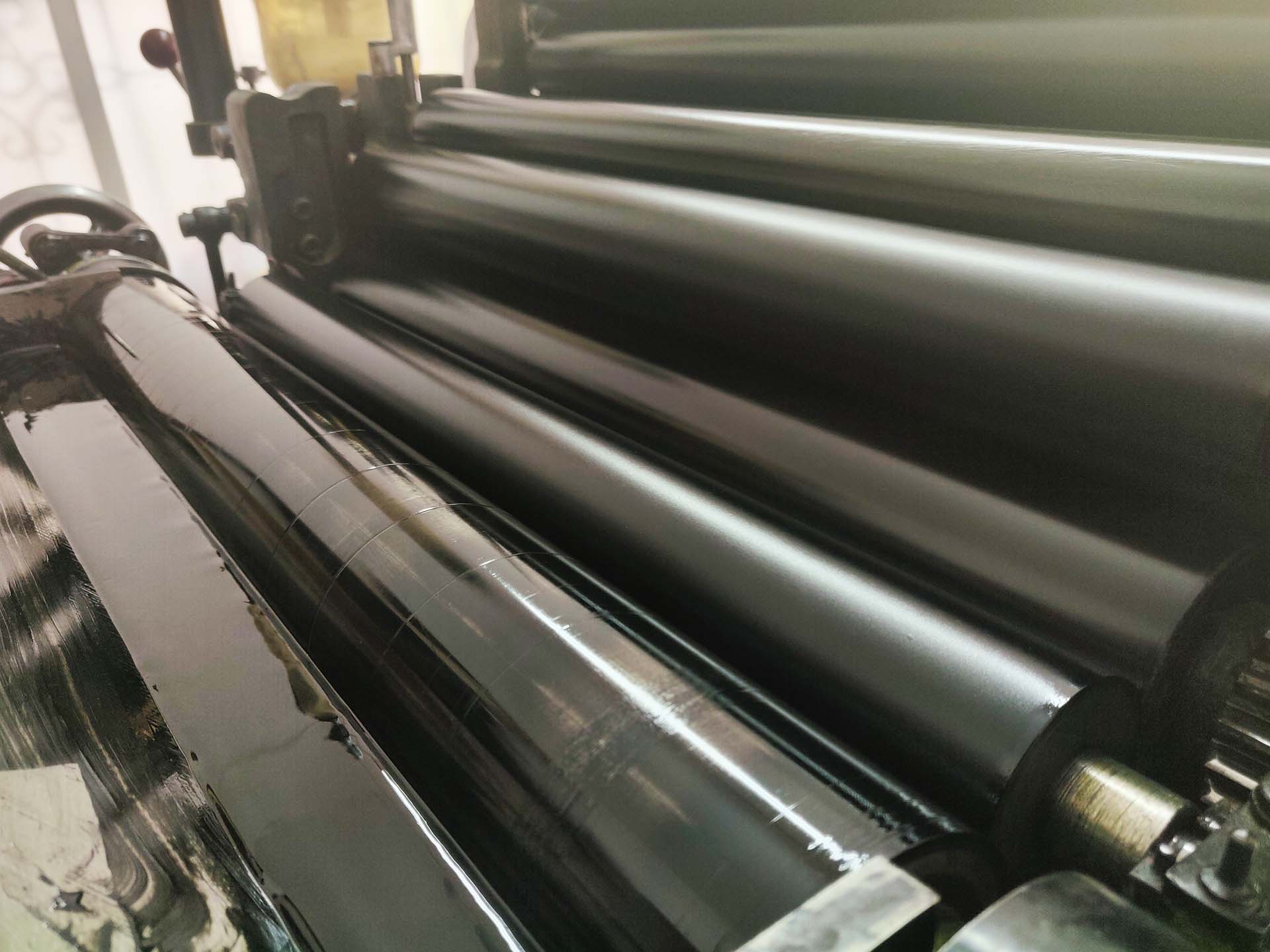
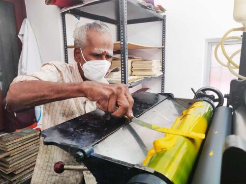
By the time Daya Process sent over the finished blocks to us at our print workshop, we’d got the Heidelberg press ready for printing. It was cleaned and its moving parts tinkered, adjusted and oiled. The printing room acquired a festive look, with piles of paper stacked in a corner, and the tins with the four printing colours – red, blue, yellow, and black – set out. Some of them could be used straight out of the tin, and others had to be mixed into the shades we wanted.
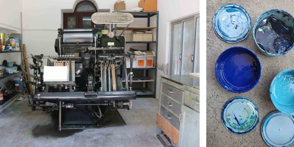
The Heidelberg press and inks at AMM Screens
We had decided on the sequence in which the colours would be printed – blue, yellow, red, and finally black. But we needed to do a test run first, to check whether the blocks with the different colours were aligned and registered properly with each other. To cut costs and wastage, our test run was done just with black ink – the key was to make sure that the ink sat evenly on the rollers, and to ensure no over-inking. On no account did we want to wash the rollers and start again! The printer then set up the block in ‘the chase,’ (as the frame is called), carefully checking for position, distance and alignment. The chase was then clamped into the press.
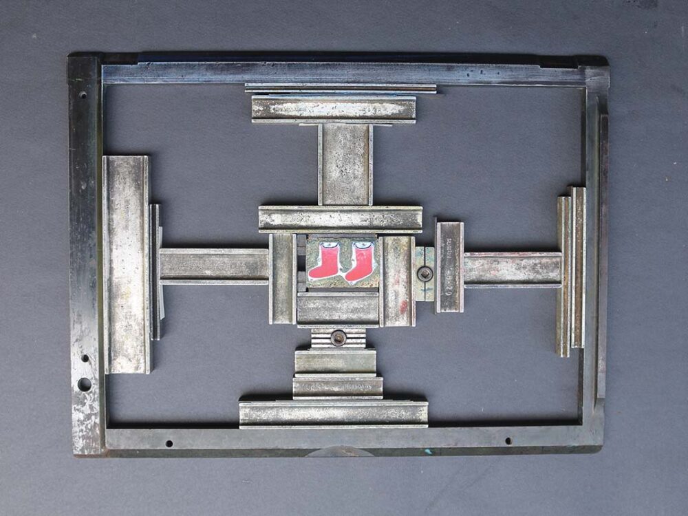
Black ink on the rollers and the blocks being positioned in the chase
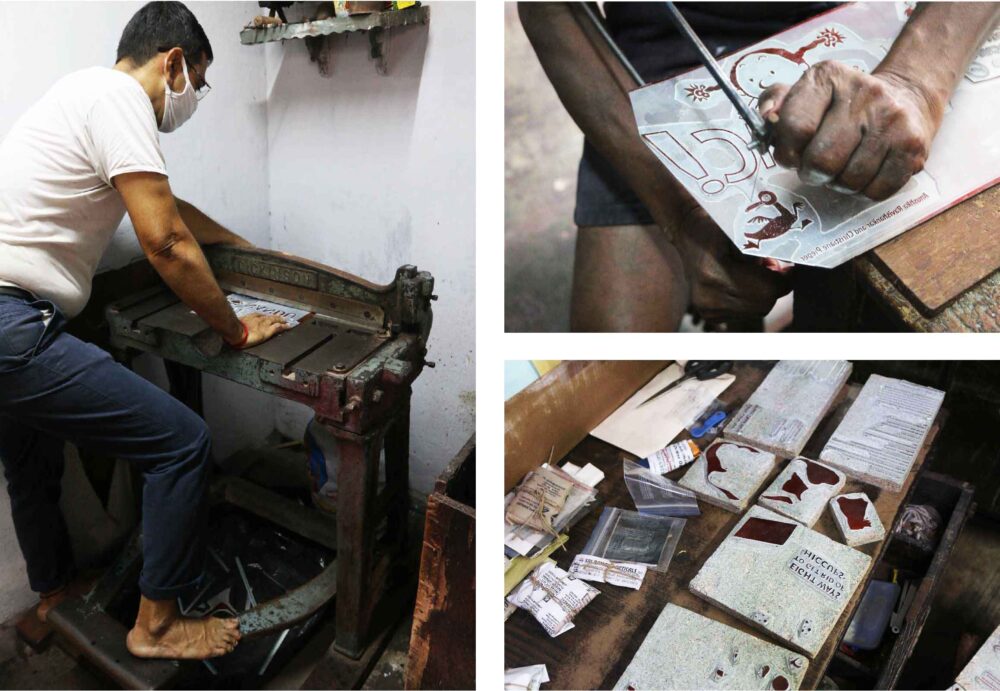
As the press clattered into action, the rollers moved across the plate, until it was saturated with enough colour. These first impressions were of the black outlines of images and the black frames that held each of them in. The printer inspected these closely to check whether an image sat right on the page, and within its intended frame. If an image appeared skewed, he tweaked the block in the chase until he was satisfied that the alignment of elements matched those on the page.
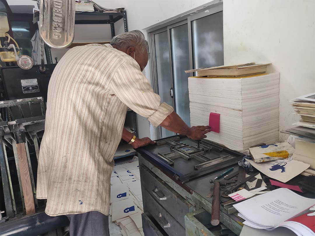
Adjusting the alignment
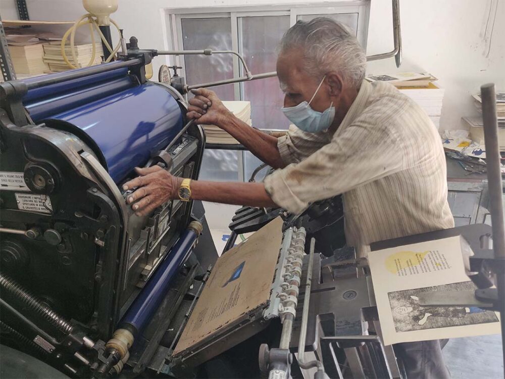
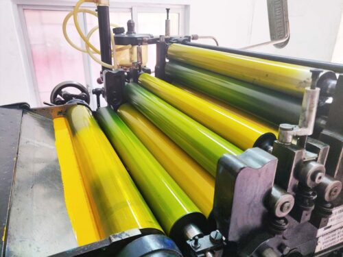
Misalignment can prove to be a serious problem, if the block isn’t cut properly or if the etching isn’t positioned right on the wooden base. If that happens, the block has to be sent back to the workshop. Luckily, it went well for us: the alignment seemed right, so the rollers were wiped clean, and we were ready to print the first colour – blue. Then the best part of the process began, as sheets of blank paper were fed into the printer.
The windmill arms of the Heidelberg in action
But we couldn’t relax just yet: using the initial black impression as a measure, the printer tweaked the block’s position in the chase until the printing was sharp and clean. Then, once he was satisfied, he let the sheets with blue through, until all the pages were printed. They were then set aside to dry. Patience was now called for, and we waited until the sheets were properly dry and ready to be fed again into the printer for another layer of colour. And so it went on, until all four colours were done. Here are a couple of examples of how various colours were printed in layers.
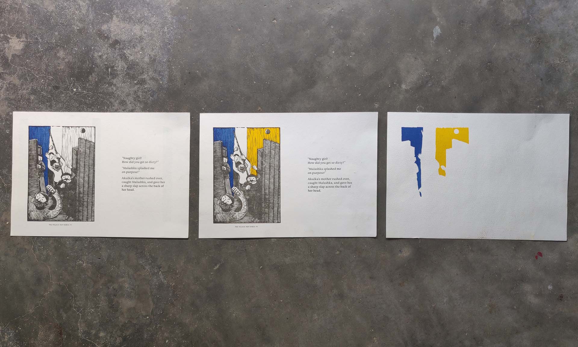
A new colour on the rollers and the layering of colours
Even though we’ve been in the publishing world for over 25 years, the actual feel of holding a newly printed page is exhilarating, every single time. For this particular project, it was all the more so, since it was genuinely challenging to get to a point where we could produce a letterpressed book in the quality we wanted. We’re justly proud of our journey there, and of the artisanship that allows us to take printing traditions forward in the way we have.
The gorgeous prints we’re releasing now have been created through the same painstaking process that went into the making of the book. We’re sure you’ll enjoy their happy energy. And now, having discovered how they were made, you’ll also remember the skill and artistry – from the lino etching to the letterpress printing – that went into creating each of them.
V. Geetha is a writer, translator, social historian, activist, and a freelance editor and a leading intellectual from Tamil Nadu, India. She has been active in the Indian women’s movement since 1988, organizing workshops and conferences. Geetha has written widely, both in Tamil and English, on gender, popular culture, caste, and politics. Click here to discover Tara Books she has authored.
Sanjana Vamadevan is a visual communication designer from Chennai. She studied graphic design at the National Institute of Design, Ahmedabad. Illustrating, experimenting with analog printing techniques and hand lettering are some of the things she’s passionate about. Click here to discover Tara Books she has designed.
No Comments