

19 Dec Sorry?… Thanks!
by Gita Wolf and Catriona Maciver
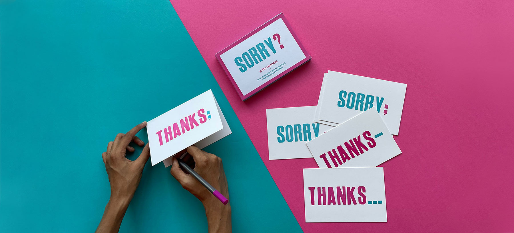
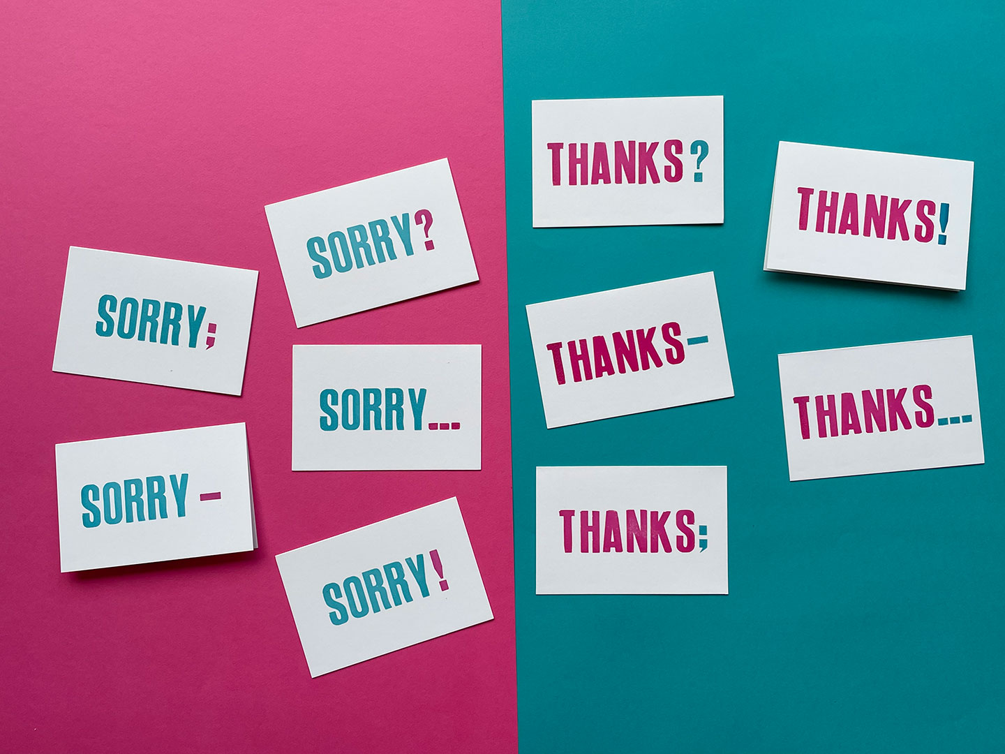
It’s that time of the year again: time to look back and mull over things we’re thankful for… and also – quite possibly – sorry about. An apt time to bring out a set of cards that say just that, we thought. But there’s more to it: we also wanted to add a bit of complexity and a twist of emotion to what are essentially simple words. And what better way than to punctuate them? So if you want to say sorry for something you’ve done or left undone, or thank someone in more ways than one – or better yet, keep them guessing as to what exactly you mean, these cards are for you. We enjoyed coming up with them for two reasons – for the wit with which it allows you to potentially twist meaning, and for the chance to say a lot with little. We all love to puzzle our loved ones, occasionally.
Designer Catriona Maciver, who works as a designer for Tara and also runs Studio Tolsta, created this set of cards. She recalls the process that started off with a conversation several years ago:
The beginnings of this project go way back to 2012, when I and another designer from the UK, Oliver James Mayes, started a 6-month residency with Tara Books. As is the working culture at Tara, we were all sitting around throwing up ideas for potential projects when the thought of making ‘Thank You’ cards came up. From there it was a step away to add a bit of polarity with the word ‘Sorry’, and we started playing around with various ways to say ‘sorry’. Oliver’s ‘Sorry?’ when he missed something no doubt contributed to the whole discussion. As is often the case with new projects, we thought that something that appealed to us would work for others too. It was a chance to combine the usefulness of such cards with the fun of playing around with words and ambiguous meaning.
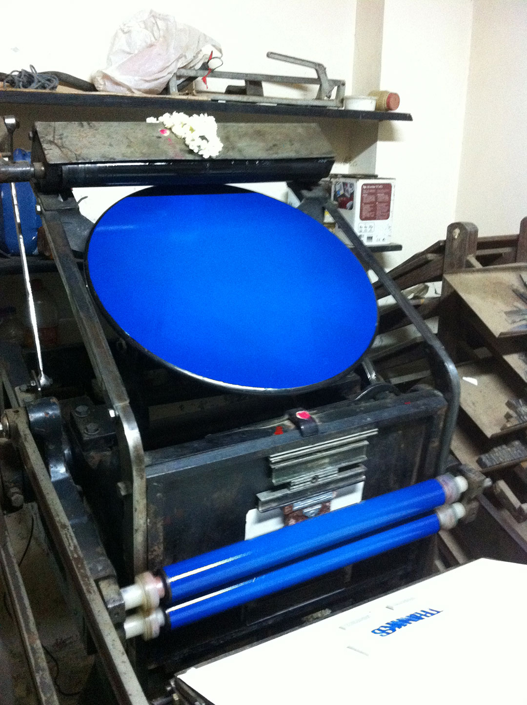
It also happened that Oliver and I were very keen to check out the new letterpress machine that Tara had acquired: so why not print these cards on a letterpress? At that time, we were both graphic designers who worked mainly with book design, and mostly on a computer. One of the reasons we had wanted to come to Tara was to explore the element of hand crafting in book making. So when the letterpress idea came up, we went straight over to the workshop to see what was possible.
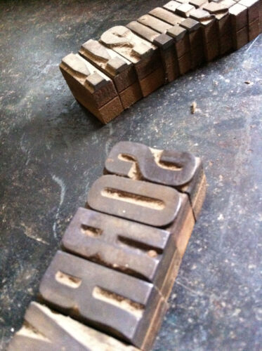
Exploring the letterpress room for the first time
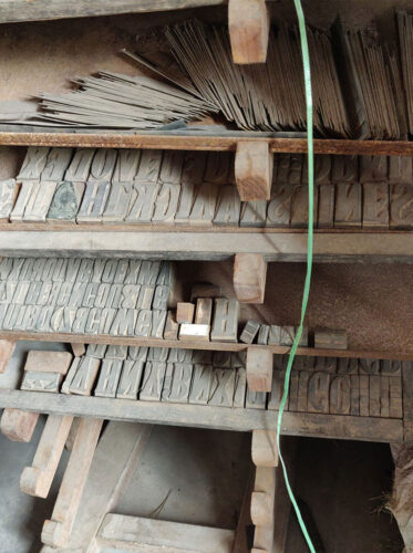
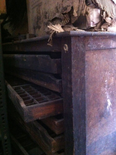
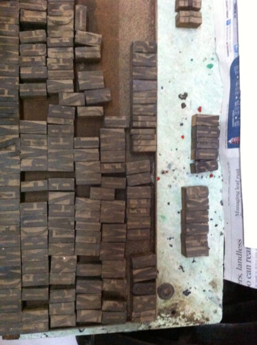
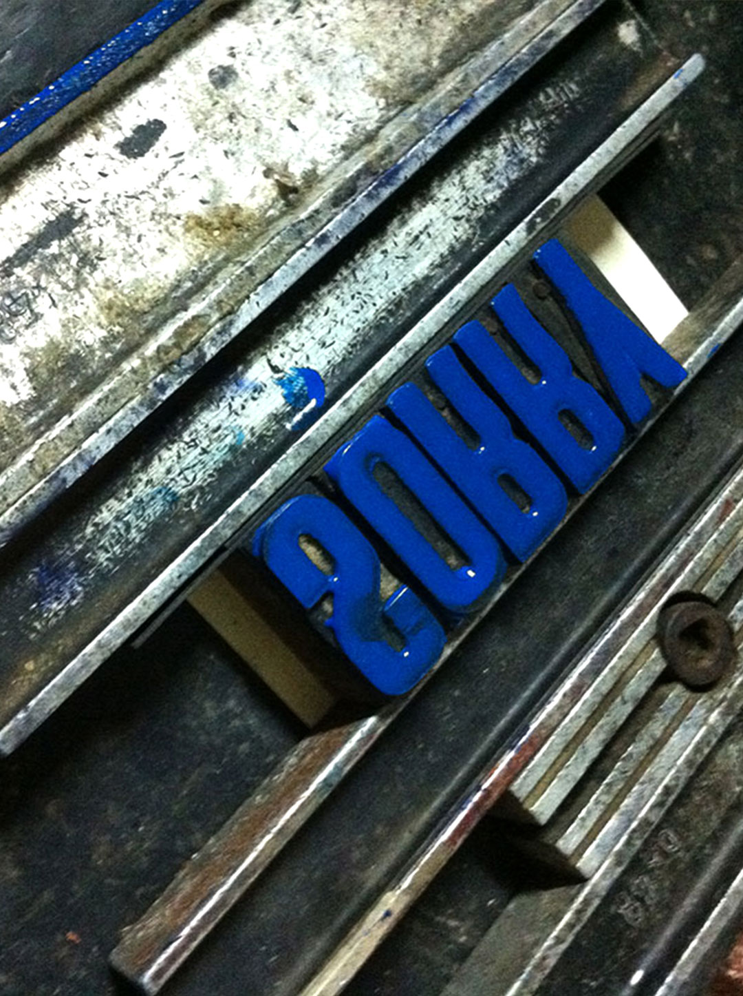
and rummaging through old cases of type.
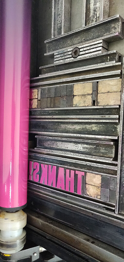
It was a sensory experience, to say the least, to rummage through dusty drawers full of metal and wood type in all shapes and sizes. Sadly, most of the sets were incomplete – since Tara had bought the press second hand, and the type was thrown in – so we found ourselves hunting down characters to form words, as though we were putting together a puzzle. We enjoyed the simple act of laying out the type by hand and trying out different arrangements of the words ‘Thanks’ and ‘Sorry’, and the amusing change in intonation and expression when we added punctuation marks to the word. A simple enough tweak, but the meaning changed – sometimes subtly and sometimes quite dramatically.
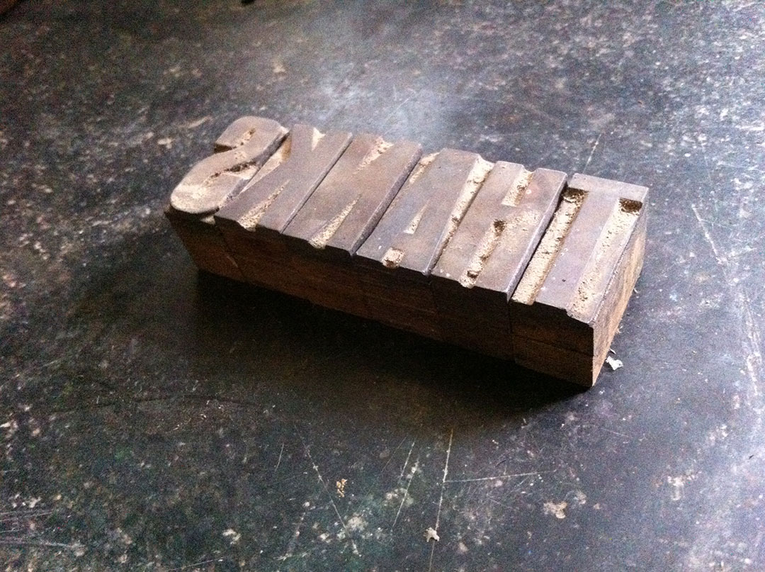
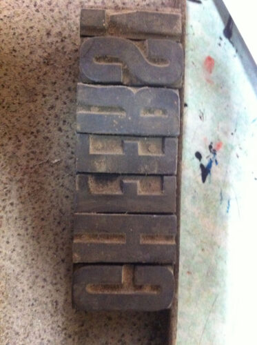
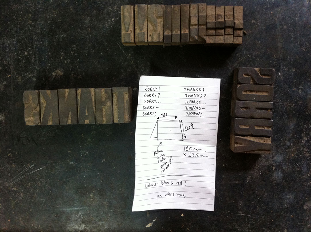
Experimenting and playing around with different arrangements
What struck me during this process was how my approach to design changed. It’s a bit like the difference between taking photos with a digital camera and using a film camera with a limited number of possible shots. You need to be careful about each move, be much more intentional and considered, since the possibilities are limited and finite. Mistakes are harder to correct and every change tends to be laborious. Compared to shifting things around on a computer, a very different approach to design is called for.
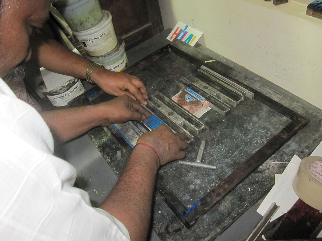
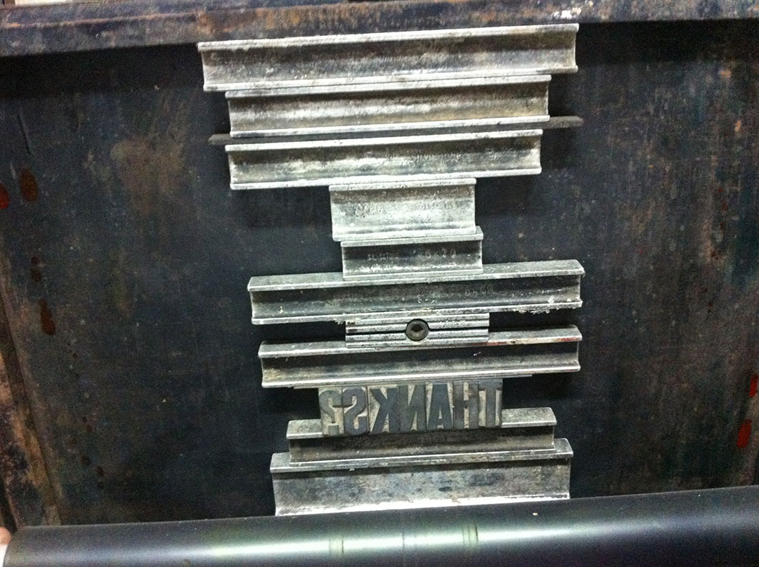
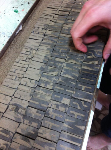
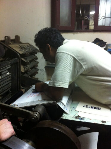
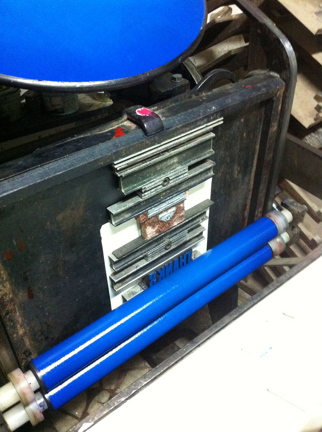
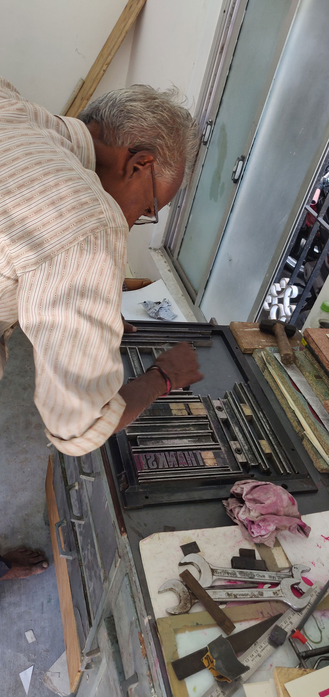
The time consuming process of hand setting the type
and locking it in a chase (metal frame)
I found it strangely liberating to work with certain constraints: keeping to the size, style and number of characters available, as well as limiting the size of the cards to that of the metal printing bed. Inspired by the charming simplicity of the original idea of saying ‘Thanks’ and ‘Sorry’ in various ways, I was keen to reflect this in all aspects of the design. The layout, the fonts, the colour palette, and the type of paper needed to be pared down. So although in theory we could have created new printing plates and opted for any number of fonts or illustrative design elements, this potential for limitless options seemed to go against the nature of the project. Put another way, if a single punctuation mark can alter the intonation and emphasis, then the design needed to be equally suggestive, while holding back. So I decided to stick to the type that was available in the letterpress workshop. I really enjoyed not only the limitation of working with these existing blocks, but also the process of allowing them to dictate the design – bringing them back to life, in a way, after being stuck in a drawer all these years.
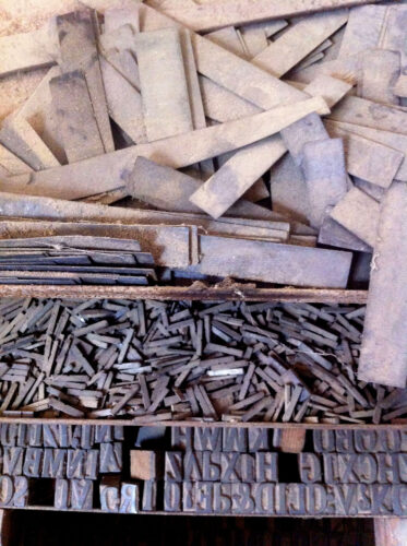
A case of type with missing characters
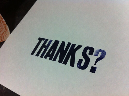
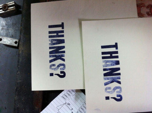
As for the colour pallette, I wanted to stick to two contrasting colours, to highlight the polarity of the words ‘Sorry’ and ‘Thanks’. Cyan and magenta seemed appropriate as they felt bold, playful and visually striking. Once the concept was finalised, the design almost took care of itself. It only needed to be printed.
But it wasn’t all smooth sailing, things began to go wrong with the letterpress we had at the time. The samples we managed to print were disappointing, and our efforts to restore the machine didn’t work. We had to eventually give that press away. So what with one thing and another, the project was archived and almost forgotten… for years, as it happened.
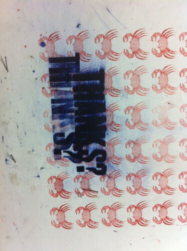
Disappointing results
As luck would have it, we recently had the chance to buy a letterpress machine again, this time in good working condition. Some of the projects that had been literally and metaphorically put away into dusty shelves, were revived one by one. So the time for ‘Sorry’ and ‘Thanks’ seems to have arrived at last, and here it is, hot off the press.
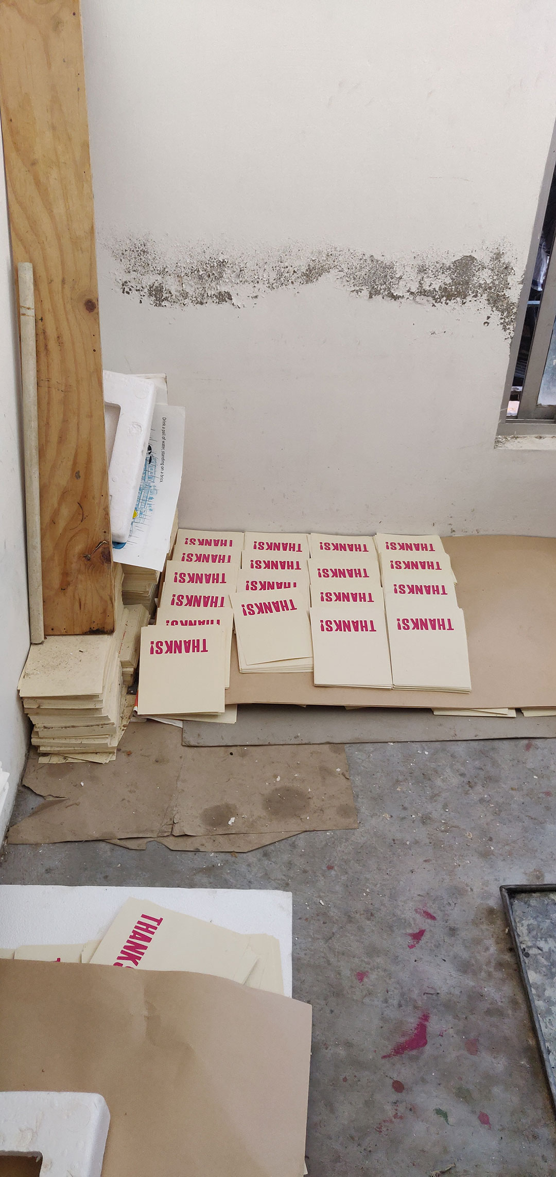
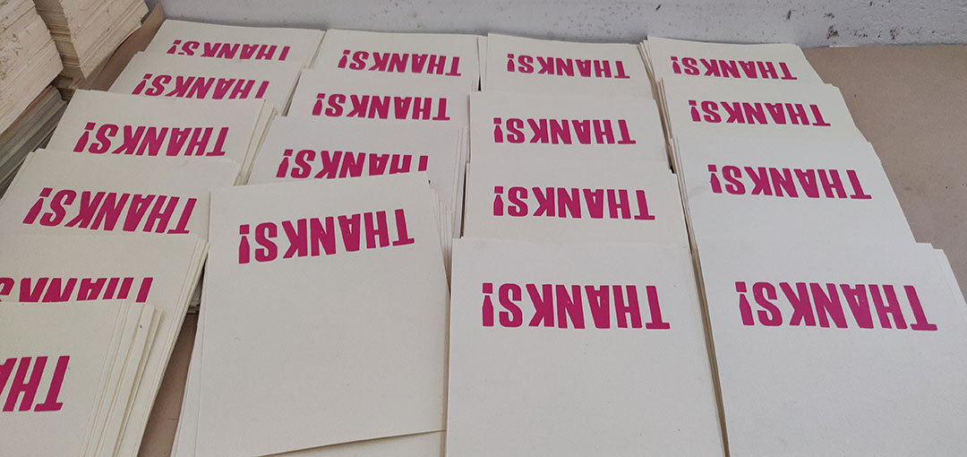
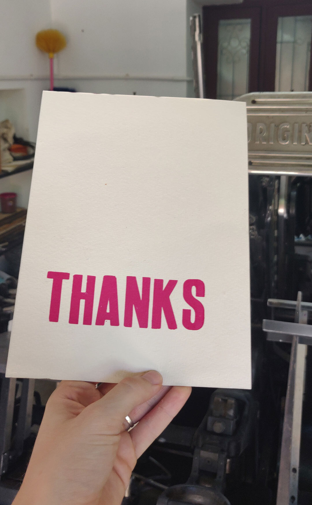
Finally we were happy with the printing results
The playful and tactile aspects of this project have stayed with me through the years. They remind me to get off the computer once in a while and work more with my hands. For that, I say ‘thanks…’
Get your copy of the card box here.

Catriona Maciver is a multidisciplinary designer from Scotland. After graduating in Graphic Design from Central Saint Martin’s College in London, she travelled to India to explore traditional artisanal craft and culture. It was this interest that led her to work for Tara Books in 2013. Catriona now lives in Chennai and runs Studio Tolsta, a product and textile company specialising in contemporary handcrafted homewares and travel goods.

Gita Wolf started Tara Books, as an independent publishing house based in India. An original and creative voice in contemporary Indian publishing, Gita Wolf is known for her interest in exploring and experimenting with the form of the book and has written and over twenty books for children and adults. Several have won major international awards and been translated into multiple languages. Click here to discover Tara Books she has authored.
No Comments